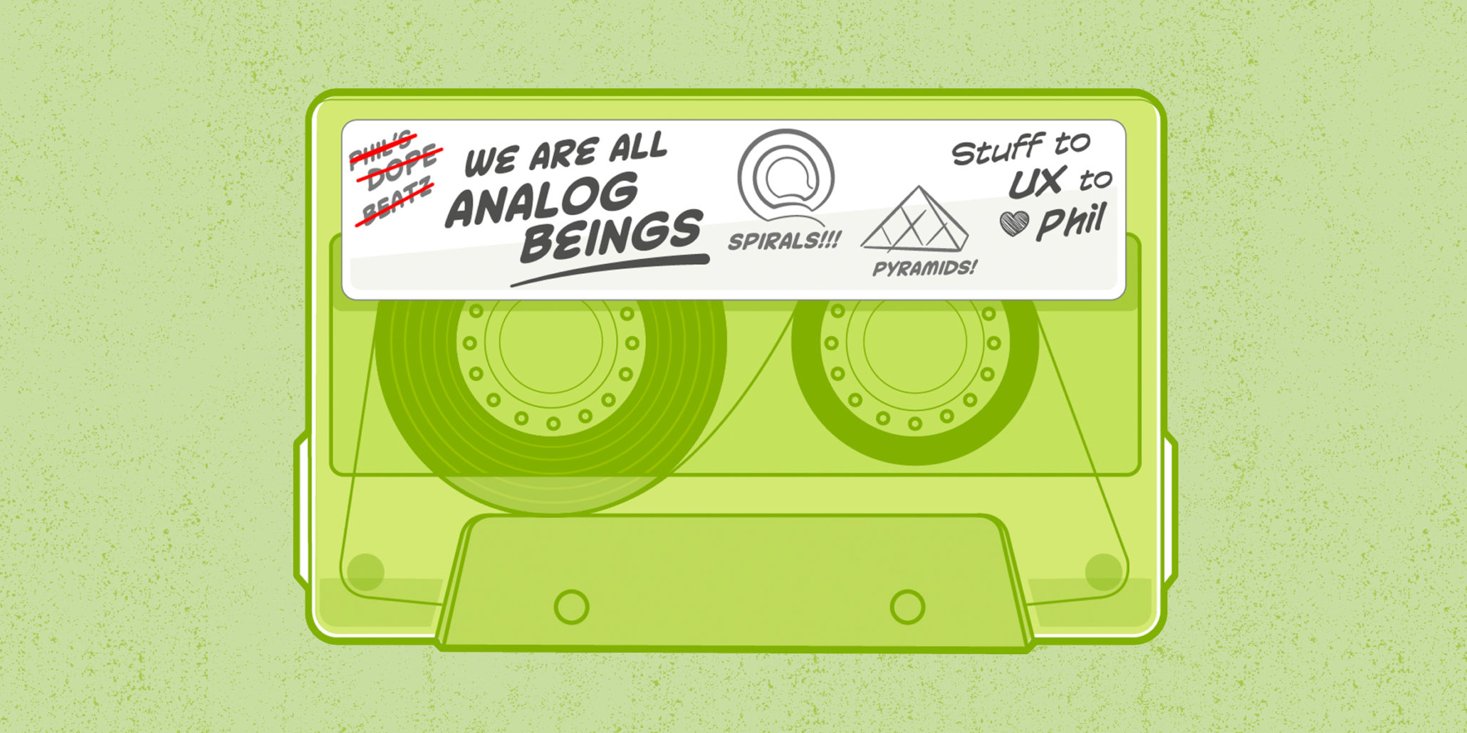
We Are All Analog Beings

Not too long ago, a client challenged our use of the word “analogue” in the middle of a Think Session. I don’t remember the quote exactly, but he said something like this: “Maybe you guys could put together a few analogues for that interaction. ‘Analogue?’ Am I using that right? You guys always use it. Anyway, can you see how other applications are doing this, and then give us one of your presentations so we can make a more informed decision?”
This conversation launched an archaeological expedition among our gang to figure out if a) the term was common in the UX field, and b) we were confusing our clients by using it. The answer to our rudimentary research was a) sometimes, and b) sometimes.
I recall using the term as far back as the late 1990’s. Russ and I worked together at that point, and not long after we teamed up with Brad at another company. When the three of us talked about UX in the early days of Think Company, our lexicon was already set.
But when we launched our most recent discussion on the term, some thinkers mentioned that “analog” seems too reminiscent of cassette tapes. We opened a debate about which spelling we should be using – “analog” or “analogue.” (Both versions are technically correct, but the latter provides clarity for those who may be wondering why I’m writing about cassette tapes.) This point led to another debate about throwing out the term completely and using substitutes like “exemplar” or “samples.” Finally, we wondered whether the idea of finding analogues is any different from doing competitive research. Then, I may have started to Photoshop one of our portraits onto the reel of a cassette tape until work got in the way of fun and it never saw the light of day…
This is how conversations unfold inside the walls of our studios. Sure, the discussion started with a single question, but we quickly jumped to the types of questions we find ourselves asking every day: “What’s the history of this thing we’re investigating?” “What are we really trying to achieve?” “Who does this impact?” “What will the grammar police think?” “Let’s discuss this over lunch, who’s buying?” “Does anyone have a photograph of Brad that could easily replace a cassette cog?”
As an adjunct college professor, I love debates like these because they remind me of the best classes I’ve led—classes where everyone is curious, talking openly, refining old ideas and forming new ones. I spend much of my classroom time leading discussions on the history of design and communication theory, and I usually have my students read Don Norman’s article on the topic, Being Analog. Norman explains that the human mind works by making associations (i.e. analogies) rather than through discrete interactions. Norman wrote and titled the article as a reaction to Nicholas Negroponte’s book, Being Digital, which explored how our lives would change as technology advances.
The main theme in my classroom—and in almost every book on digital design that I love—speaks to this point: when we work with computers, we are analogue beings interacting with digital beings. Computers need to be digital, but their interfaces do not.
In light of our recent debates, the UX group at Think Company got together a few weeks ago to talk about how we use analogues. We ordered pizza, because that’s what analogue beings do—we eat. We shared examples of “analogue decks” we’ve used with clients in the past, and we discussed how we plan to use them in the future. Once again, we started making associations because—you guessed it—we are analogue beings.
One great insight I took from our discussion is that we tend to use analogues with our clients in two different ways. I’ll try to spell them out below with examples from architecture, another design discipline. I once had a roommate who majored in architecture, so I’m kind of an expert.
Macro Analogues
Macro analogues help to inspire a design effort by taking a look at how others approach similar goals. Imagine an architect meeting with a client for the first time to design a modern art museum. He would be remiss if he didn’t talk about other museums already in existence, and how these structures honor the work of great artists.
But what if he also introduced a discussion on how Egyptian pyramids were monuments for the accomplishments of Pharaohs? How different is this discussion from one about exalting the accomplishments of modern artists? I have done no research into this and I don’t plan on it—so please feel free to shoot holes in this theory—but I imagine that this is what I.M. Pei did when he first told the folks at the Louvre that he wanted to drop a big glass pyramid into the courtyard of an historical landmark. I’m glad he (theoretically) used an analogue to shore up his position.
Micro Analogues
Micro analogues help us to find solutions to very specific design challenges by considering how those challenges have been solved in other places. We look for design patterns that match because analogous beings are great at pattern recognition. This approach combines a little bit of “don’t reinvent the wheel” and “if it ain’t broke don’t fix it”—all mixed together with a healthy dose of “avoid cognitive friction.”
Again, I have done no research on this whatsoever, but I imagine that when Frank Lloyd Wright dropped a giant corkscrew ramp into the interior of the Guggenheim, he was trying to solve the challenge of getting people from one floor to the next without disrupting their experience. He had access to several analogues: stairs, elevators, trampolines, ramps and catapults. Perhaps he chose the ramp because he thought it solved a specific set of challenges. I’m sure a smart designer like him could have imagined something brand new, but people know how to use ramps—and it fit within the design. Heck, it became the design.
That’s what digital designers do, too.


