Our most-loved UX and technology content of 2022

As we approach the end of 2022, we’ve taken a moment to look back at all the work our team has accomplished this year! From blog posts to guides to insights reports, we’ve been busy sharing our breadth of expertise in UX, design, and technology.
We put together our top 10 most loved blog posts from this year, filled with insights, strategies, and tips from the Think team.
The Top 10 user experience and technology blog posts from Think Company
10. The ROI of Design and Development Collaboration in Digital Accessibility
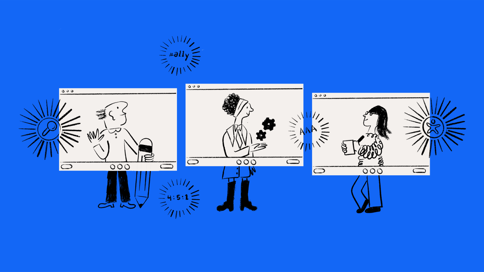
Accessibility is crucial to the success of your product. By integrating design and development in the early stages of a project and fostering a collaborative environment, your team can create accessible components users will love. Check out this blog post to discover how you can foster a collaborative relationship between design and development as part of your accessibility efforts.
9. Refactoring Mountains of Legacy JavaScript Code
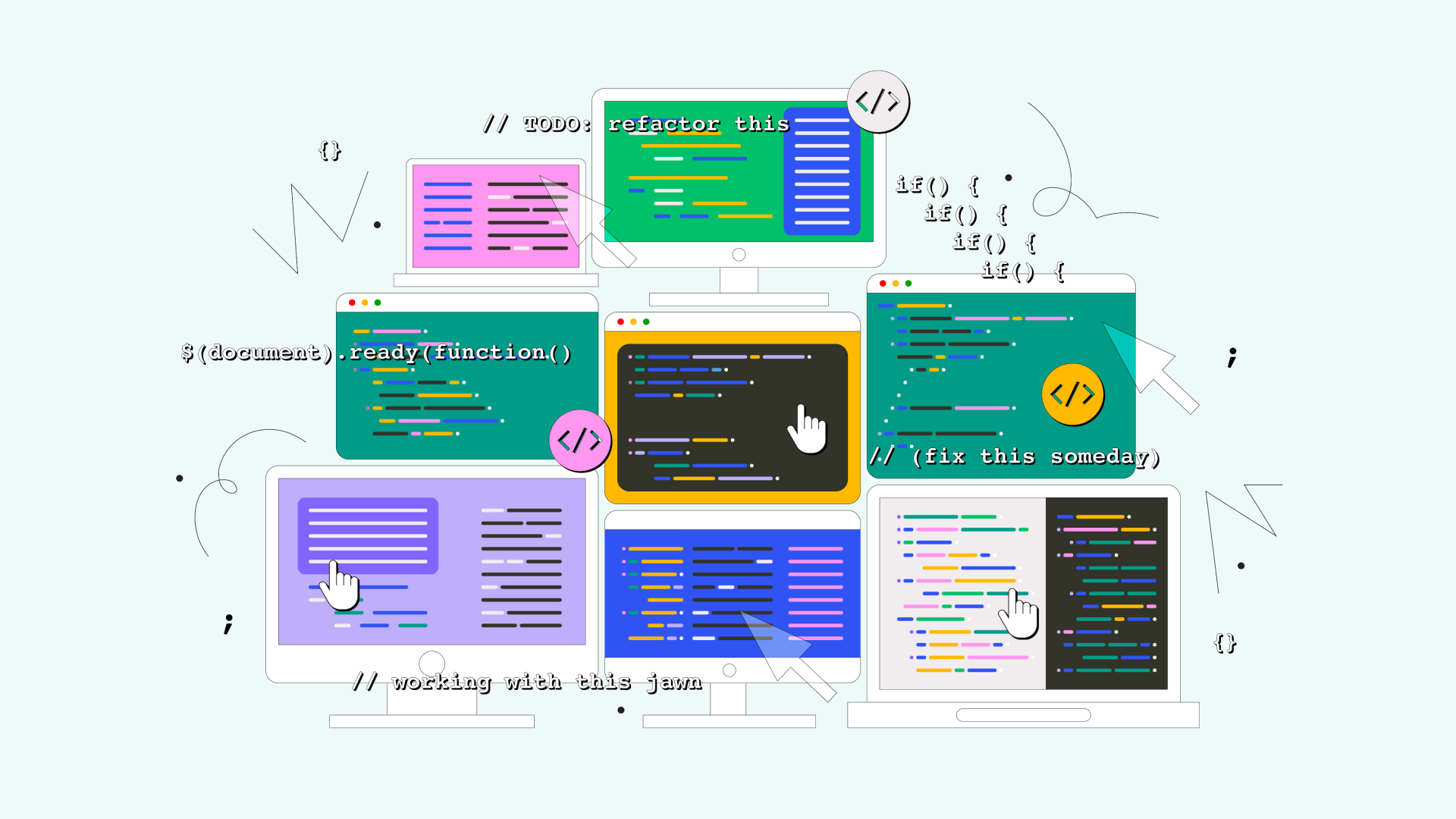
Several years ago, our team inherited a 6,000-line JavaScript source code. Someone had to refactor all that code, and we were up to the task. In this blog post, we share our process and what we learned from refactoring such a huge amount of code.
8. How to Create Modern Interfaces in Salesforce
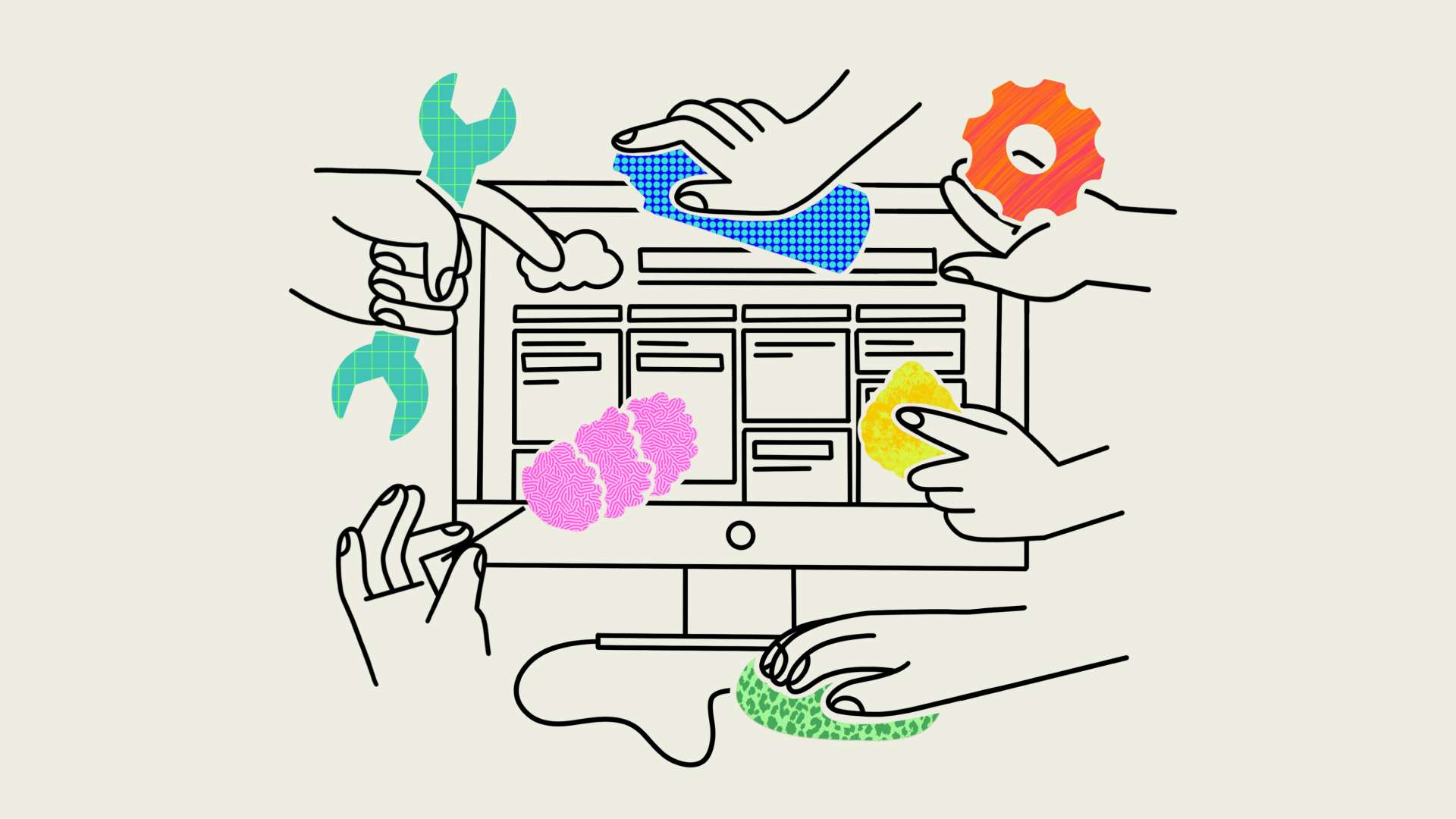
Salesforce can be a powerful tool for business success, but most teams require assistance to effectively leverage it. Learn more about how we can help teams customize Salesforce and seamlessly incorporate it into their work practices.
7. Contextual Inquiry Principles and Processes
At Think Company, we often conduct contextual inquiries to better understand how users interact with a digital tool. This helps us make product improvements that serve real user needs. If you’re looking for a tool to help fill gaps between a product design’s intent and its actual usage, we’ve got you covered in this blog post.
6. Our CEO’s Thoughts on 15 Years of Think Company
This year was a major milestone for us as we celebrated our 15 year anniversary as a proudly independent company. It’s been quite the journey. Our CEO Russ Starke reflected on all that we’ve accomplished over the years that led us to this moment, and what it means to be a Thinker. Check out what he had to say!

5. Why Think Week was Worth the 308-Mile Commute
This year we kicked off Think Week—a new initiative that brings us all together in our downtown Philadelphia office a few times a year. A week full of collaboration and activities; they were big lifts but very worth it. After our first Think Week, Thinker Hannah Dardashti shared why participating was a meaningful experience and important to our Think Company culture.

4. The 3 Building Blocks of a Successful Modern Design System
A modern design system streamlines the creation process and ensures that new designs are consistent across products while driving sustainable growth. Want to learn more about what it takes to implement a modern design system? Our experts share their design systems knowledge in this blog post.

3. 6 HCP Engagement Best Practices for Pharma Leaders
While working with numerous pharmaceutical organizations in the U.S. to create strategies that increase HCP engagement and improve their operations, we learned a lot about core UX practices that directly impact business goals. In this blog post, we share UX best practices for biopharmaceutical leaders looking to better engage with HCPs.
2. How to Create an Affinity Map for Research
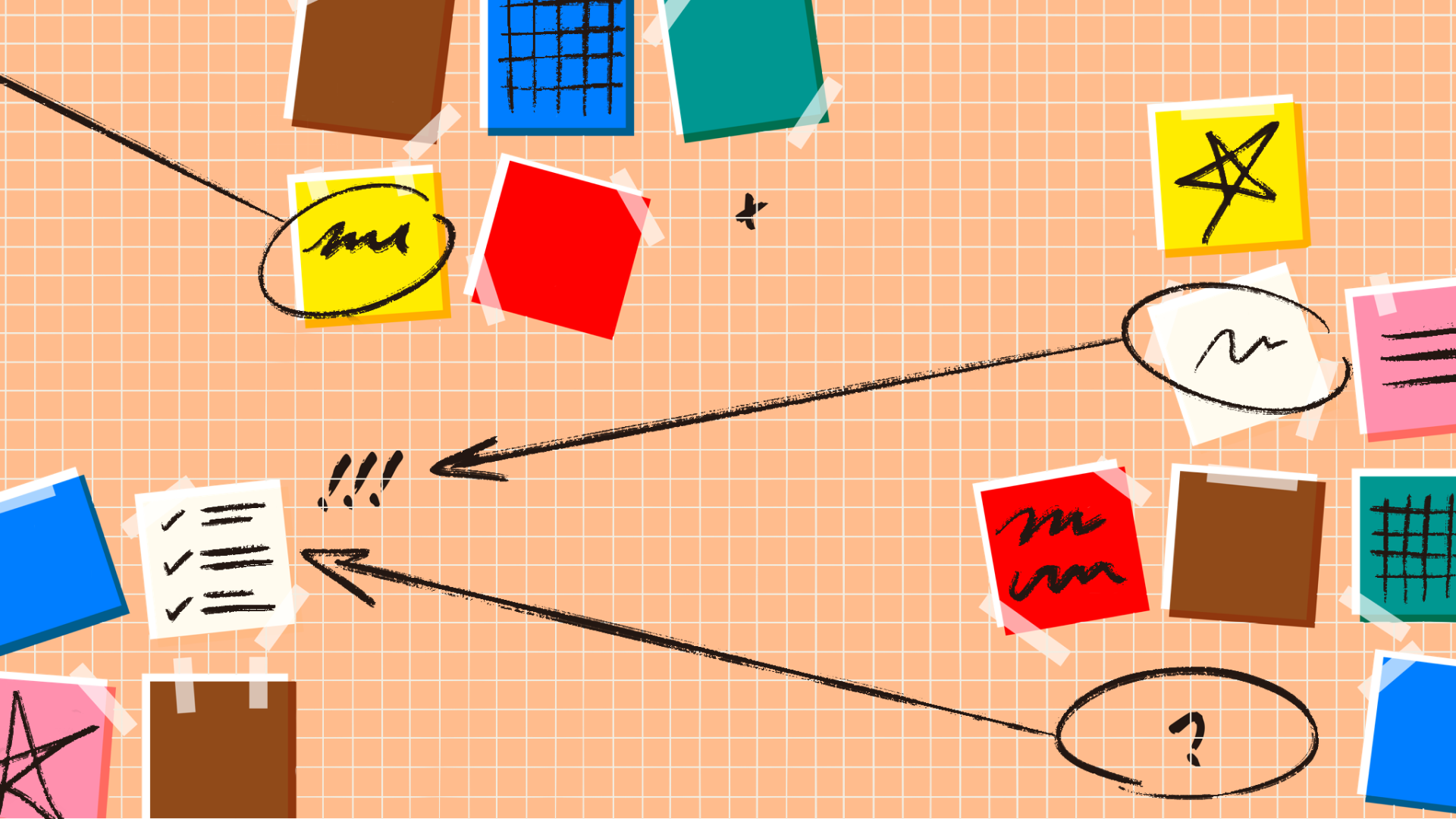
Here at Think Company, our practice is grounded in research. We utilize many methods and tools throughout the research phase, and affinity mapping is one of our favorites. Affinity maps help us synthesize our research data so that everyone on the team can easily see and understand our findings—leading to better informed design decisions. They’ve been a great source of collaboration for our team, and we think yours will love them too!

1. Career Paths in UX Design
Our top blog post of the year! We’re proud to be a trusted source for those looking to start or enhance their UX careers. In this blog post, a group of expert Thinkers shared what it takes to dive into the UX world and the various paths your career can take.
More UX and technology insights to come in 2023
At Think Company, we’re dedicated to creating seamless experiences for our clients. Our team continuously focuses on education, research, and bettering ourselves so that we can provide valuable insights and help our clients improve their digital tools.
Our blog uncovers the voices of our Thinkers from various backgrounds and expertise. We’re proud to have highlighted so many Thinkers this year, sharing their knowledge with colleagues, other UXers, our clients, and potential partners. Stay tuned as they continue to share valuable insights and trends in the new year. Here’s to 2023!


