The Fold is Dead. Long Live The Fold.

The past several years have seen a slow and steady decline in the population of viable newspapers in the US. Along with this has come an outcry for the loss of many newspapery things like objective reporting, long-form investigative journalism, and locally-focused news outlets. One thing that’s not going anywhere, though, is the concept of The Fold.
If you’ve been even tangentially involved in the world of web design, you’ve heard of The Fold. Likely, you’ve heard it used thusly…
“We need these 47 elements above the fold. Can’t you just shrink the text?”
“Marketing is going to want their badge above the fold.”
“We need to present our disclaimer language above the fold.”
The idea being that if a user doesn’t see everything that needs to be seen in the first three seconds of their visit, they’re never going to see it.
Seriously?
In his fantastic Life Below 600px, Paddy Donnelly points out that the whole concept of Above The Fold was to entice people to buy a newspaper based on the top half of the front page. They didn’t try to cram a headline for every article up there, just the key few. The bulk of the content appears below the fold or even (God help us), on a deeper page.
Meanwhile, usability practitioners have been preaching for well over a decade about how scrolling is safe. Furthermore, if you design your page to encourage scrolling and give the user a reason to read, you’ll do even better.
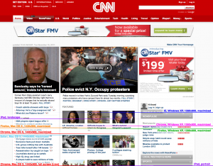
On top of all of this, can anyone out there tell me where The Fold lives? ‘Cause screen resolution ain’t even the half of it. You also need to consider:
- Browsers: IE? Firefox? Chrome? Safari?
- OS: OS X? Windows (XP, Vista, 7)?
- Window Size: Full screen, windowed?
- Toolbars
I’m sure one could take all these factors into account and come up with an over/under for The Fold, but really….
While my design brain wants to say The Fold doesn’t matter, the research brain makes a strong argument for not ignoring it. As with so much in life, it’s really a combination of both. So let’s break it down even more so there’s no confusion:
Yes, people scroll…
…if we give them a reason to scroll…
…and we consistently reward their scrolling.
Ironically, maybe we’d be better served by taking the metaphor that started all this to the extreme. Next time your co-workers or clients mention The Fold, pull out a newspaper (assuming you can find one) and look closely at how they manage it. While you might not want to emulate their business model, you gotta admit they’ve got layout nailed.


