The Cost of Cheap

“I’m too poor to buy cheap things.” I don’t know its origin, but it doesn’t really matter–this quote changed me. I always cared about quality but never thought of it in these terms before hearing it a few years ago. Unfortunately, I’m constantly reminded of just how relevant (and revolutionary) the idea is thanks to the omnipresent lure of cheap: “this will hold me over until I can afford what I really want, and I’ll have it in two days with Amazon Prime.” Shop, buy, break/dislike, repeat.
Earbuds
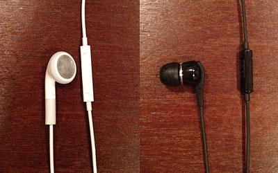
My latest cheap debacle involved new earbuds for my iPhone. I read reviews, scoured Amazon customer ratings, talked myself out of anything over $100, and eventually decided on an $8 hold-over pair until a nice pair of Beats didn’t feel so…indulgent.
The earbuds I ended up with were made by Samsung. At a basic level they work fine: I plug them in and I can hear the music I’m playing. Not the roundest sound but good enough to keep me happy while commuting (bicycle or train). The base model retails for an astonishing $2.50 (hey, I’m admitting to what Frank Zappa called “cheepnis“) but I ponied up an additional $6, paying just over $8 for the inclusion of “hands-free” controls and a mic. I became addicted to these pocket-free controls while using the horribly uncomfortable (and sonically inferior) earbuds Apple includes with each iPhone. After plugging in Apple’s free earbuds, it took some trial and error to figure out how many clicks did what but soon enough I was skipping songs, answering calls and telling Siri my life story without ever digging for my phone in my pocket.

Enter the new headphones. The control system that Apple invented seemed so obvious that I assumed it was adopted as convention: change the volume by pressing the outter edges of the button; single, double, or triple press the center of the button for all other commands. And honestly, given the swirl of allegations in the Apple vs. Samsung legal wars, I (unconsciously) assumed that the “slavish copying” issue would play to my advantage here. Not so. After a month I still haven’t figured out what this strange button on my new earbuds is supposed to do, let alone how it actually works. What I do know is this:
- It doesn’t adjust the volume (probably the number one desire of headphone users)
- It can reliably start and stop a song, and occasionally skip a song, but usually pulls up Siri for no apparent reason
- There are two raised bumps on the button that, I can only guess, provide a haptic cue about where the appropriate hit areas are to register different commands. But if that’s the case, it would require such precision and dexterity that it renders their specificity useless while on the move, let alone sitting still.
In a way, this is an unfair critique. These earbuds, presumably, were not designed specifically for the iPhone. But they were designed for some phone. So where are the volume controls? Why is there so little tolerance for error? Why didn’t someone actually try to use these for a week before signing off on them? How do we calculate opportunity cost here? How do we measure the day-to-day frustration of owning and using something that doesn’t work well versus the actual cost savings? The problems that result from going cheap, at minimum, escalate over time…at maximum, bad things happen.
Websites
When thinking about “cheap” we often talk about things like build quality, ingredients, manufacturing, and — a little more often now — design. Most of us can recognize cheap in the digital world…websites can feel cheap, videos can look cheap, music can sound cheap, and the experience of “cheap” doesn’t necessarily correspond with a project’s budget. I’ve been wowed by “amateur” stop-motion videos and frustrated by the on-line ordering process of a multi-million dollar company.
The secret of cheap is its avoidability. As consumers we can hold out for quality, no matter how much it hurts in the short-term. As makers, we should have the pride (and respect for others) to try something out for a bit, and run it through the gauntlet before inviting the rest of the world to join us. If it’s frustrating, rethink it. If there’s a rough edge, sand it down. If it’s junk, trash it. With beta versions and pressure deadlines this type of evaluation can be difficult. We all know that. But managing that is an integral part of the design process. Sometimes we all try to delude ourselves. Our frame of reference for quality can vanish during the blur of progress. We just need to keep in mind that there’s a difference between beta and junk.


