Super Team-Up: Think Company & TJU Improve Healthcare
Since our company was formed (and for many of us, even prior to that), healthcare innovation has been near and dear to our hearts.
It was inherent in the first product we created as Think Company: a groundbreaking medical information portal that allowed healthcare providers to search for clinical product data, use it to construct personal libraries and print custom handouts onsite, and even search for off-label information—all in the context of a well-rounded medical conversation and benefit:risk analysis.
Passion for innovation within healthcare has been evident here every day since, as we’ve worked hard to exploit design and technology to raise the bar through products including:
- Educational dose illustrator tools
- Hospital intranets
- Interactive patient affordability and assistance tools
- Medical device training materials (usage/handling/cleaning)
- Reimagined, easy-to-use body map diagrams for medical charts
- Redesigned, holistically considered patient experiences (including optimized workflows, systems and tools)
- Payer tools
- Portals for unique patient populations and their caregivers
So, it didn’t come as a big surprise when a friend of the firm said he needed to introduce us to a “kindred spirit” who was part of a team challenging the healthcare status quo from within. It did come as a surprise that not only did this person want to shake things up and embrace innovation (in a sector where that can sometimes be a pretty uphill battle), but was interested in applying universal principles of Design Thinking to attacking challenges and working with folks who were making big waves through entrepreneurism.
This pioneer (and fast friend) turned out to be Bon Ku, MD, MPP—Associate Professor of Emergency Medicine at Thomas Jefferson University, Director of the Design Track of the “College within a College” program, and Director of the IDeA: Innovation & Design Application program as well. I’m tired just typing all of that.
Emergency Room Redesign
Early conversations were ambitious and far-reaching, but to our delight Bon was interested in applying the underlying concepts right away to prove that innovation was possible even when the constraints are significant.
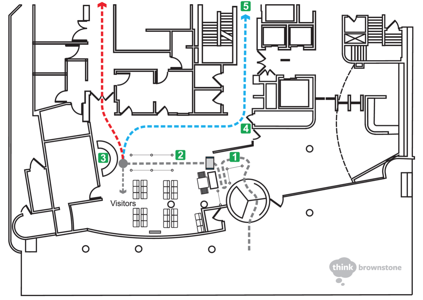
Though we’re often researching, designing, and building for enterprise-wide digital solutions, we started small but meaningful in an area of expressed pain: the confusing and cramped workflow of the TJU Hospital Emergency Department. This included the experience from building entrance through registration, the waiting process, and on into triage.
Our constraints were clear from the outset: the large and imposing metal detector had to remain, as did seating for at least 20 people. There could be no removal or relocating of walls, and there wasn’t a budget for new purchases. We were game.
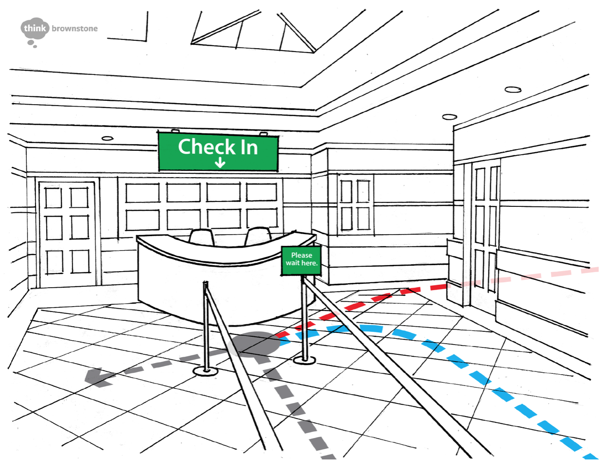
After a few sessions of fly-on-the-wall observation, informal interviews, and sitting in on a staff meeting, we aimed to apply Design Thinking principles to show that significant improvements can be made, even under strong constraints, when they’re applied deliberately and thoughtfully. Our design artifacts included a floor plan depicting the recommended new workflow and points at which new signage should be placed, blueprints of various views of the redesign, and other suggestions for removal of distracting messages and workflows.
“By helping us to redesign our ED, the Think team improved metrics such as reducing the time it takes for a patient to be seen by a provider and shortening length of stays.”—Bon Ku
Building on Success
That small win then led to us together tackling another challenge, and one that had been a bit more perplexing: redesign a highly-trafficked space in the middle of triage to serve as a secondary staging waiting room.
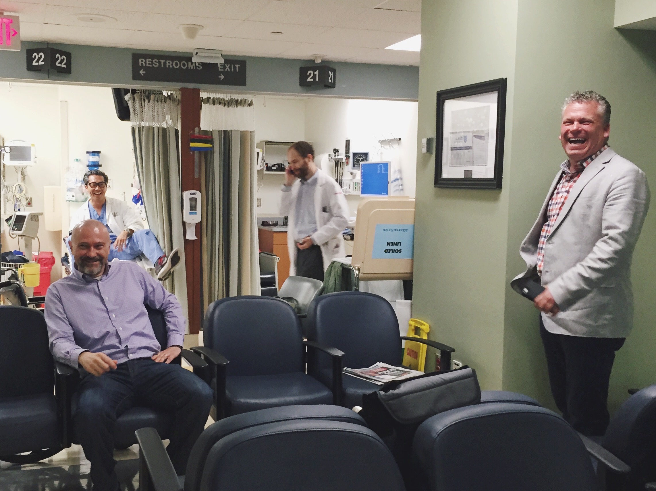
Constraints this time around were to preserve a thoroughfare generous enough for wheelchairs and equipment, and to comfortably seat at least 20 people including at least 2 bariatric seats.
Could we do that and make it feel truly inviting and relaxing in such an intense location? Could we make it feel protected and purposeful enough, and could we also preserve patient privacy with a waiting room so close to treatment rooms and computer systems? Following our process, you betcha…
Mentoring Medical Students
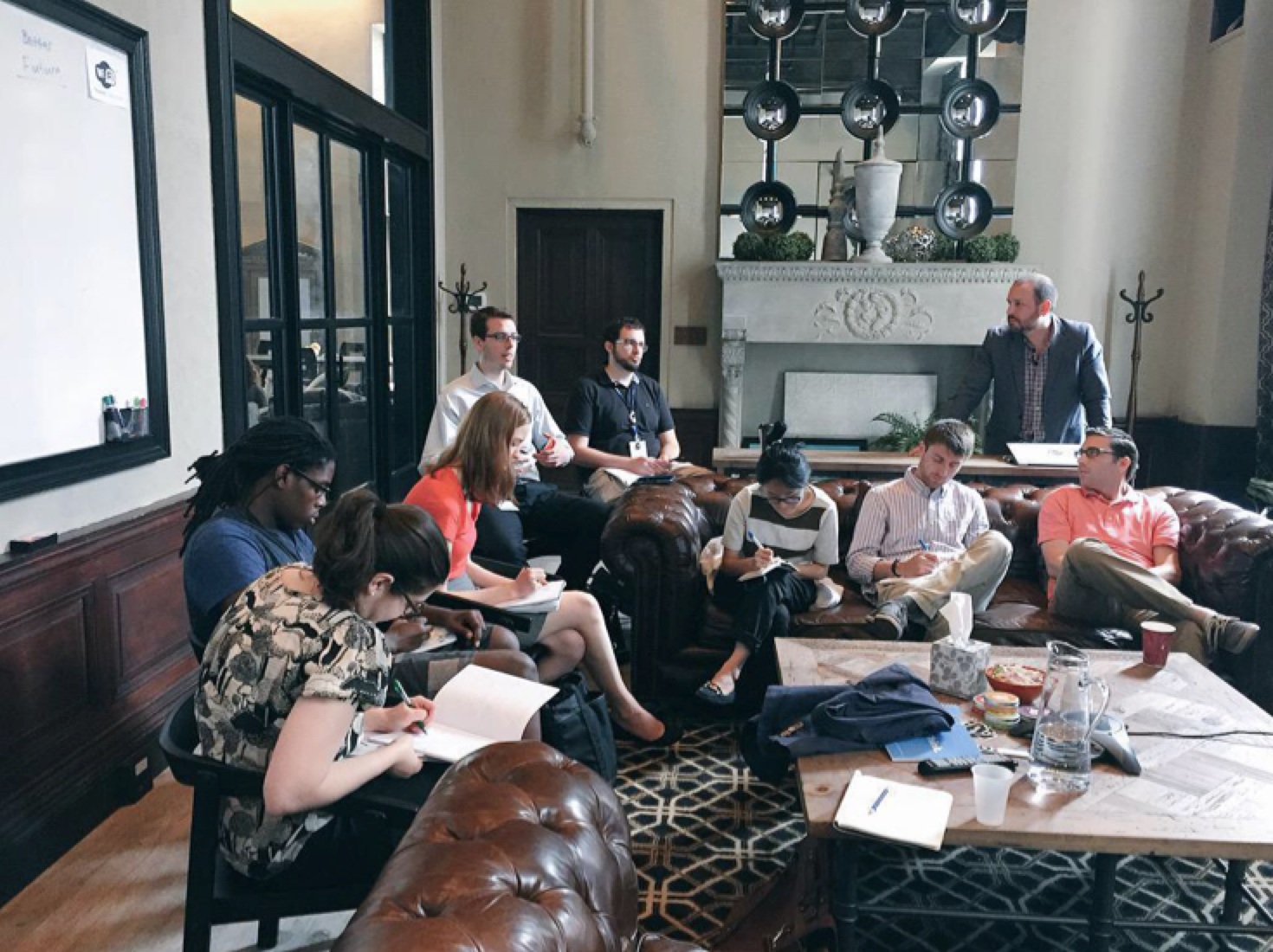
At this point, things started to get very interesting. Bon invited our team to join an impressive group of advisors and partners (including the Stanford d.school, MIT, 10xBETA, and others) that he had assembled to teach his CwiC-Design Track students about Design Thinking. We agreed to be mentors for his students on how to apply the Experience Design Process to solve an ambitious challenge: reduce medication errors in the Jefferson Emergency Department.
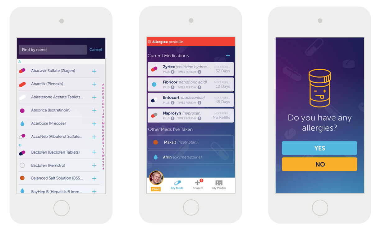
After a summer full of meetings, iterative design sessions, and the students doing plenty of work on their own (and supplying all of the subject matter expertise), the result was the core design for an application called “MedVault”—a medication reconciliation app that interfaces with EMRs, allowing patients and providers to safely and efficiently maintain a current list of patient medications across all healthcare transitions.
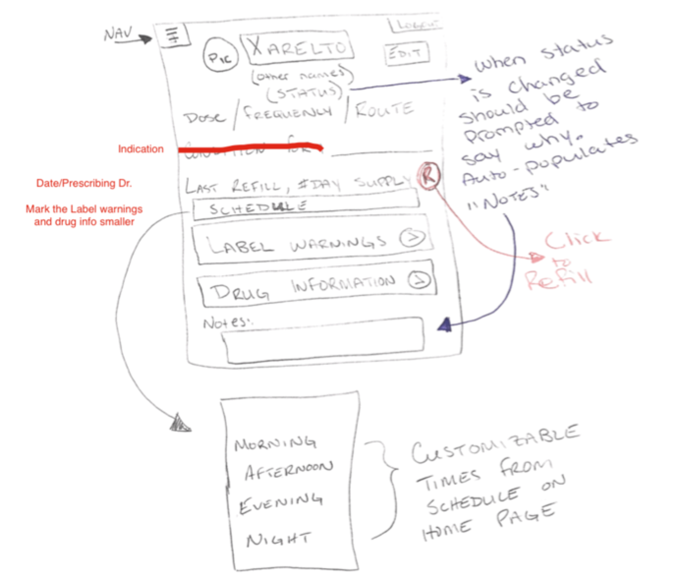
The idea was to make significant inroads in reducing preventable patient safety events associated with healthcare providers receiving inaccurate or incomplete medication histories. The group wanted to deliver a seamless interface that facilitates accurate healthcare transitions in a safe and secure method for patients to share their medication histories efficiently across the care continuum, and for healthcare professionals to educate patients about their medications.
To really help the students envision the product (and to hopefully help socialize and gain support for the building of it), we took their designs and created mockups depicting what the end product could look like.
We look forward to the next steps with TJU as our relationship continues to blossom. As the visibility, scope, and funding increases… what will we tackle next? Stay tuned!
