At Think Company, we pride ourselves on making users’ lives easier through services like product design and design systems, among others. While we’ve been steadfast in supporting our client projects, unfortunately that means we often lose focus on using our own services to maintain and improve our website.
Last year, it got to the point that even the most seemingly inconsequential updates often broke unexpected parts of our website or required a significant code lift to implement. We finally had to put our foot down and undergo a big website refactor before we were overwhelmed by technical debt and the site was beyond repair.
This spring, we launched the refactored site with little fanfare. To create such a seamless and subtle transition, our team spent months dedicated to refactoring our backend to improve the employee experience of content editors while maintaining the user experience for our site visitors, and we think we succeeded!
Here are the basic steps and considerations we made while working through this process. Thinking through these steps ultimately led to a finished product that works for our team, created a seamless transition to our redesign project, and provided value to us through increased site speed and a better employee experience.
Making the decision to refactor a CMS
Looking back, we’ve debated whether this website refactor happened because of the events of 2020 or if the final push came from the tech debt pile-up that blocked our path forward. During our transition to a remote environment in 2020, we found ourselves with more internal bandwidth. That bandwidth—coupled with some upcoming marketing initiatives, including a series of virtual UX events—highlighted the timeliness and need for new, easily editable, and replicable pages, and that may have been the push we needed.
When we first formed our internal website team, the marketing department had quite the list of new features and pages to create on the site—with hopes of making their jobs easier. Every new feature request required a lot of involvement from the development team. Often, these changes had unintended consequences for other parts of the site or unexpected obstacles, which meant longer timeframes and, at moments, some very creative adaptation needed on all accounts. We’re an agile team in all manners, but those adaptations started to pile up and slow down the marketing team’s progress, impeding content production and our ability to reach new goals.
We knew then that it was time that we “eat our own dog food.”
Starting this website refactor project meant we’d be making it a priority to provide our employees (marketing team, content contributors, and others who support our website) with the tools and user experience they deserve to do their jobs.
Getting started with a website design system
So, what did we know we’d need right away? A modular CMS (Content Management System) with the flexibility to continue to add new features without dependency on development time. That’s when we addressed our first problem: without a design system in place, we had no way of creating iterative, global change to the many elements of our site. So we started by building out our design system in its entirety to ensure our design and development teams were on the same page with the components and capabilities of our CMS.
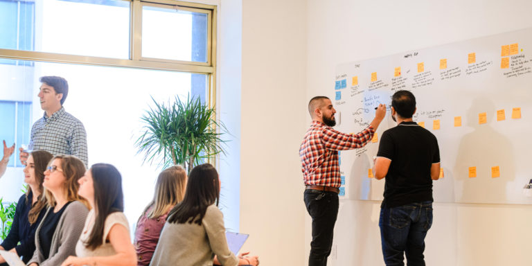
The process was pretty linear. In our weekly meetings, our design and development team would collaborate to build out the design system, answering questions like:
- What’s the intended purpose and use of each component?
- What variations will we need for each component?
- What should our naming system look like? (Always a tough decision.)
We did a lot of problem solving and collaboration during this phase that would eventually lead to a quicker integration process in the final steps of development.
Building a modular CMS with flexibility in mind
When we got to the point where development was ready to create the components of the design system, we had a lot less internal time available than we did initially. The ability to directly share component work with the designer who made a certain component—via Storybook—made collaboration a lot easier.
When thinking about the modular CMS we wanted to build, we had to consider a few things:
- Content creation needed to be much easier and more flexible than before. How can we give content creators all the freedom they need?
- We needed to remove as much code as possible while maintaining as much content as possible.
- Features needed to be built to allow content creators to add and remove them from a page without affecting the look and feel of the rest of the page.
To keep moving forward, our team of developers (who were rolling on and off the project as their time allowed) had to stay super focused on recording notes in Jira tickets and explaining the handoff of components to other developers. Through diligent use of tools like Storybook, Miro, and Slack, we experienced a successful design and development handoff.
Now, our brand-new backend was ready for content—and we had to begin the process of making the transition as seamless as possible for our website visitors.
Migrating website content seamlessly
At this point, we were thinking about the flexibility of the final product and keeping our eyes open for the website content migration that was to come. We wanted to migrate as much content from our current production site as possible, but we knew we couldn’t shift 100% of the content over automatically and would have to get help from some team members to do it manually.
It was a big lift.
We gathered a group of a few Thinkers, including our marketing team, to build out all of the remaining pages on our staging site. Throughout this process, our developers logged and fixed bugs, our content migrators confirmed component usage with designers, and our QA rockstars tested the pages across multiple devices and looked for any discrepancies. This process eventually led us to a successful and uneventful (yay!) launch of our refactored website—which on the front end looked pretty much the same as the previous website, but beautiful when you logged into the CMS!
Improved speed, performance, and employee experience
After the launch, we saw some immediate wins. Our site speed and performance jumped. The site’s render speed decreased from 3.70 seconds to 1.99 seconds, and the number of requests the site made dropped from 23 (122 KB) to 9 (47KB). Our content editors and marketing team now had the world at their fingertips—without requiring developers to intervene.
During the final few months of our refactor work, we also started an internal project to redesign the website. By treating ourselves like we would our clients during this website refactor project, and by stepping back and assessing our internal team’s needs, we set our redesign team up for success. Our previous redesign took well over a year to complete. Because of this upfront design system and development work, we completed our website redesign project in less than six months—and we can now roll out iterative changes on a regular basis without having to wait until the next redesign project. We’ll call that a win!
Watch out for more on our redesign project in an upcoming blog post.
Want to chat about how our team can help you with your unique design and development challenges? Let’s Think together!


