Myths and Realities of Designing for Accessibility

Designing for accessibility has a bit of a negative reputation. It’s not that designers think accessibility is a bad thing—everyone wants their site to be accessible by the most people possible. It’s that accessibility is often seen as a chore, or as something to check off of a list. It becomes an afterthought that’s implemented at the development stage.
Instead, designing for accessibility should be a point of focus from the beginning of any digital project.
Here at Think Company, we are working to make accessibility a top priority. We recently ran an internal project to bring more focus to what it means to design for accessibility. Through research and design audits, we’ve created a foundation of information to help us better understand and define accessible design as a company.
I’ll candidly admit that my initial impression of designing for accessibility wasn’t great, but I’m happy to say that my opinion has changed. This project helped me realize how seamless it can be to include accessible designs from the start. Accessibility is now naturally one of the factors I consider while designing.
By sharing my original assumptions and how this project contributed to changing them, I’m hoping I can provide some insight into what it means to design for accessibility.
Myth: Accessible designs look plain and boring.
Reality: Accessible sites can be beautiful and delightful to use.
Many sites optimized for accessibility do consist of plain text on neutral backgrounds, with simple images and little consideration for visual appeal. But they don’t have to look this way.
Yes, there are certain things you need to consider when selecting a visual style, but sometimes all it takes is a small tweak in the color, hierarchy, labels, or buttons to ensure the information on your site can be understood by all. Be considerate of layouts and navigation. Check out simplyaccessible.com for an example—it’s visually appealing, simple to use, and accessible.
Odds are, sites designed correctly for usability are already well on their way to being accessible. Remember, if you have to stop and wonder if an area will cause a hiccup for any user, it probably will—and it could be a breaking point for users accessing your site in different ways.
Myth: Designing for accessibility means checking a list.
Reality: Designing for accessibility means considering all users and how they may interact with your site.
Just because you’ve checked off items from the 508 Standards doesn’t mean your website is accessible. And usually, simply checking the items on this list is exactly what leads to those plain, boring designs.
Get creative. Spend time really auditing the flow of your site. Use (properly tagged) images and icons in addition to color. Communicate your message using the right language and make sure it’s available in the necessary ways. Use the checklist as a starting point, but be sure you test with users. Your site needs to be accessible, but make sure it’s actually usable, too.
Myth: Accessibility gets baked in during development.
Reality: Accessibility should be considered from the very beginning of the design process, and early research participants should include individuals with disabilities.
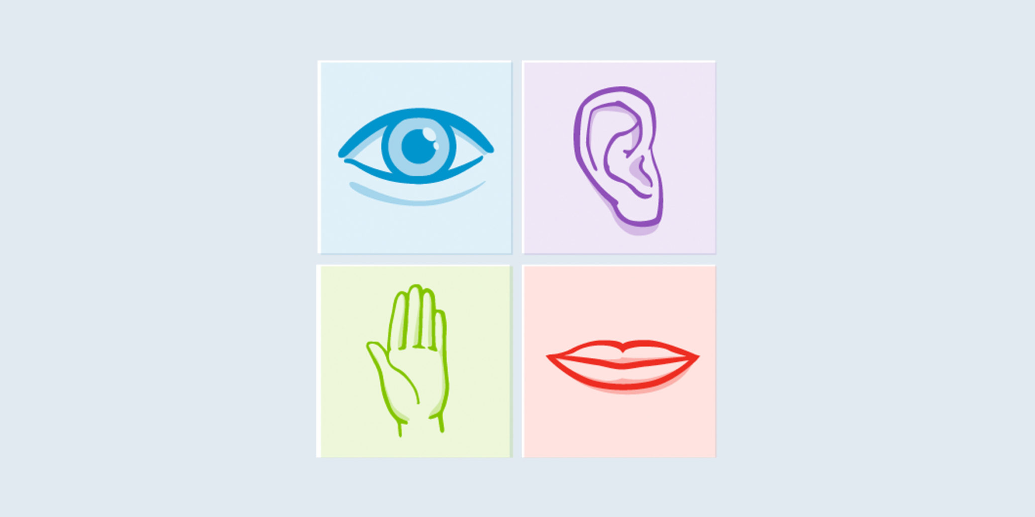
Workflows and wireframes should be designed to consider all use types, considering things like keyboard control, voice commands, low visibility, screen readers, etc.
Usability tests should be conducted with all user types. Each stage in a well-structured design process tests how your users are understanding and interacting with your site or app—be sure those users include individuals both with and without disabilities.
Myth: Designing for accessibility takes extra time.
Reality: When considered from the start, designing for accessibility takes about the same amount of time as designing for usability.
Designing for usability considers real user experiences, emotions, workflows, and use cases. Designing for accessibility isn’t much different—you should simply widen the types of interactions a user may have with your site and be more inclusive when considering all of the use cases. When done correctly from the start, you can avoid backtracking and any related increases in timeline, effort, and budget.
My Main Takeaway
Everyone needs the opportunity to have an equal experience with your site. Important and valuable information can and will be gathered in different ways, and that’s OK. Empower your users by being considerate of the various ways they will be interacting with what you’ve created. Be aware of the rules, but stay creative with the user flow and visual design. Accessibility shouldn’t be thought of as optional today. Equip yourself to be inclusive when making design decisions so that you can welcome all users to enjoy what you’ve created.


