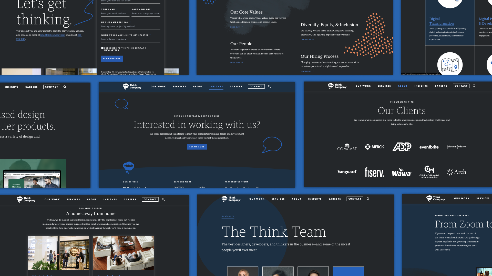
This year, we launched dark mode on Thinkcompany.com. Dark mode has become popular on mobile apps because it reduces strain on eyesight (especially at night) and is less disruptive during evening hours. As more and more sites and apps become aware of the impact of color and brightness on their user’s experience, dark-mode adoption has been increasing.
When we decided to implement dark mode on our site, we knew it would be a great feature for clients and prospects to use while browsing our site, but dark mode is more than just a toy, and we had other motivations, too. By implementing dark mode on our website, we can use it as a demo feature in client conversations, showcasing the benefits and advantages of dark mode and walking prospects through our technical approach.
We embarked on this project to improve our site and use it as a working model for clients to see what we do and how we do it. We’re our own Exhibit A here.
In that spirit, we wanted to open up the conversation even further. Here, we’ll talk about:
- Why we made the effort to implement dark mode on our site
- What the process was like
- The things we’ve learned from implementing dark mode
Because our team at Think Company has both design capabilities and development expertise, we’ll be looking at this project from both perspectives. Let’s dive in.
Why dark mode?
Dark mode can seem like a fun toy or a flashy—unnecessary—option, but it’s more than that. Just like Van Halen’s brown M&Ms weren’t about the candy, dark mode is about paying fresh attention to your entire site. The result is beautiful, but adding dark mode has incredible benefits for your front-end architecture, existing or future branding efforts, and QA. The fact that it’s fun is a bonus!
Last year Google announced a trial for Auto Dark Theme on Android. This means that if a user navigates to your site and has opted into preferring dark themes at the OS level, Chrome will show the user your site in dark mode—even if your site doesn’t have styles for dark mode. We saw this as further evidence that the industry is turning toward embracing dark mode as a standardized option. You don’t want Chrome deciding what your site should look like—we definitely didn’t—so we decided to do the redesign ourselves.
Implementing dark mode on our website
At Think, we tested all designs in Storybook. It is easier to go through a library of components and ensure each component individually is accessible, looks good, and functions well. It allowed us to go through a few iterations without disrupting the site.
After we built out dark mode in Storybook, the next step was incorporating it into the site. At this stage, we could see how all the dark mode components from Storybook looked in the context of the site.
Before we started our dark mode implementation project, our team suspected there might be too much white space between sections on the site—but not so much that it was a real issue. However, when dark mode was fully implemented, it became obvious that there was too much space, and we needed to adjust our site design.
For our team, thinking about dark mode was a great way to explore modern CSS features like prefers-color-scheme and CSS custom properties. Prefers-color-scheme is used to detect if a user has opted into dark theme at the operating system or browser level (extremely helpful when deciding whether to serve up dark mode based on a user’s OS or browser level setting), and CSS custom properties make it extremely easy to change the value of a variable based on a condition. This means we only have to change a color once, not every time it is referenced in the codebase.
Illuminated in dark mode
There is no better way to reveal whether your code has been written flexibly than to (drastically) change the background colors. Did you cut corners on your PNG transparency? You’re about to find out! So the process of adding dark mode is a fantastic way to “harden” your front-end code and get it ready for whatever changes the future will bring.
If your CSS naming conventions aren’t flexible, the process of adding dark mode—or adding themes—will immediately reveal that. If you’re working on a project that hasn’t launched yet—or hasn’t launched widely—there’s no better time to tweak your naming conventions to save you so much sorrow in the future.
Is all your product photography matted against a white background when it should be transparent? Best to find that out early so you can start amending your product-photography standards instead of having a surprising, expensive discovery a month before you’re hoping to launch your new design.
Do you have insufficient color contrast on some of your pages? To meet accessibility requirements, a contrast of 4.5:1 needs to be met. You may find that your go-to red or green color, while fully accessible on a white background, is no longer accessible on a black or dark background. The process of working through dark mode will flush out these issues. Parts of your page that had been invisible to you (“Oh, right, the footer! I haven’t thought about the footer in years!”) will suddenly jump out.
Why implementing dark mode is worth it
Dark mode is a great feature for users and a way to control how your site is seen in browsers when dark mode is automated. But the real value comes from what you learn while implementing its changes.
By adding dark mode functionality to your site, you force yourself to look at your site from an entirely new angle. From this perspective, you can unlock hidden potential, uncover issues, and take significant steps toward “future-proofing” your site.
Want to learn more about implementing dark mode on your site? Chat with our team of experts today!


