Transitioning a Fortune 100 company to Figma
The Problem
A few years ago, we had a problem. It was a problem shared by most UI and product designers in the world at the time. Our team was consulting for a Fortune 100 company, and we had just wrapped up another year with our usual design applications, Abstract and Sketch. During that time, our design system files devolved into a mess. As an early new year’s resolution, we set ambitious reconstruction and clean-up plans that stretched over our upcoming slow holiday period.
We were aware of Figma, which had been around for years, but we’d heard about bugs and missing core features. We also didn’t take Figma too seriously because there seemed to be a new design tool released every month, all promising the same thing—a collaborative, cohesive, efficient space for designers to work in—but delivering far less.
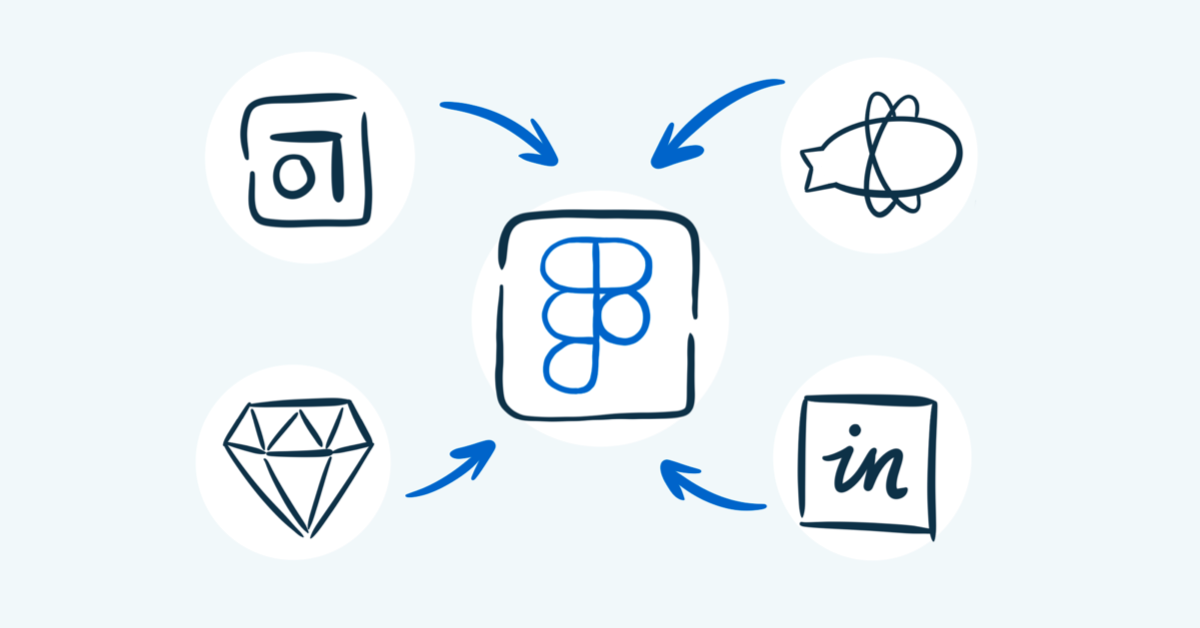
Meanwhile, we were using four tools to do a single job. Sketch was our primary design tool, with Abstract as our collaboration and version control application. We used the Craft plugin to upload our work to Invision for high-fidelity prototyping and review. Then we’d deliver our work via Zeplin when it was time to hand it off to developers.
Four applications for one process.
In retrospect, we were spending huge amounts of time managing this intricate dance. Sketch was a fine UI design tool, but it only runs on macOS, excluding a significant chunk of the potential contributor pool on our client’s team. Collaborating and reviewing work in Abstract and Invision never quite fit our workflow.
When it was time to share UI components with our developers, we used Zeplin. But there were often latency issues updating those files, creating confusion around the source of truth. Maintaining a clean and organized design asset repository across multiple apps led to miscommunications and frustration throughout our team.
Cohesion was a major headache. We had multiple products, each with their own team, under the product design umbrella, at a company with many other design departments, each with their own teams. We were siloed and isolated in private Abstract projects, forcing the team into disparate processes with different structures, assets, and general working methods.
Our design system was more of a disaster system. An enormous corporation with a burgeoning digital footprint is going to need an equally prodigious design system. But our already siloed design workspaces made it cumbersome to build and govern assets.
The Solution
2020 was a challenging year for nearly everyone, but Figma was making strong advances. They had just released several groundbreaking features, like auto layout and component variants. Our product team heard great things about the tool, and we started entertaining the idea that Figma could potentially transform and integrate our design process. It also seemed like our industry as a whole was preparing for change, and we wanted to be at the forefront of that. So we sat down with our design neighbors working on other products and product UX leadership and pitched the idea to test this new application.
As one of the first teams to adopt Abstract when it was introduced, our leadership was open to change and enthusiastic about remaining cutting-edge in the UX environment. And with more and more work moving to remote-first, collaboration was at the top of everyone’s mind. We were quickly approved for a pilot run of Figma.
Lesson 1: Elect Figma leadership
When we started implementing Figma, our first hurdle was our inexperience. Unlike other tool migrations we’ve participated in, this one didn’t have any experienced designers to help guide the process. We elected an initial, designated group to learn Figma as quickly as possible, and they would then pass that knowledge on to the rest of the team.
Figma folks were kind enough to host workshops and training sessions, and we scoured the internet, absorbing every YouTube tutorial and Medium article we could find. We dug through the mountains of content in the Figma Community, grabbing insightful materials from high-profile users like Spotify and Intuit.
Underneath all of this was a self-imposed pressure that we wanted to show results as quickly as possible. If this enormous organization was going to consider upending the way their dozens of design teams worked together, we needed to gather data and experiences that could build confidence that this was the right move.
Lesson 2: Set a solid foundation for a Figma design system
We needed to transition our UI kit—composed of both product-specific and global assets—into Figma. This forced us to make an early decision about whether we should import the entire UI kit Sketch files right into Figma or rebuild it from the ground up.
After experimenting, it became clear that in Figma, it was much better to rebuild our UI kit manually. We lost a lot of time and effort importing Sketch files directly into the tool, but things started to flow once we committed to rebuilding in Figma. Accessing your components after a Sketch import is fine, but if those components aren’t built correctly, you’ll need to break and rebuild them within your screens anyway.
Rebuilding from the start saves a lot of time in the long run. It also gets you closer to a Figma design kit.
Lesson 3: Build something
We started to see real progress when we began designing in Figma. After learning that the UI kit should come after the screens are built—not the other way around—we decided to take a handful of features we worked on in Sketch and Abstract and explore what the end-to-end design process looked like in Figma. This would also help us measure any Figma successes in a much more tangible way.
Schedule a call
See what a Figma transition could mean for your business.
The results were immediate, with our productivity and speed increasing dramatically. Building the components from the actual product screens worked like a charm. And prototyping straight from the designs—with any changes being applied in real-time, allowing us to work side-by-side with our prototype—felt like a revolutionary change.
Lesson 4: Share the win
We invited stakeholders, project managers, content writers, and developers into our files to show how well this tool worked. Admittedly, this was scary at first. But the Figma Community was a huge help here, offering free materials that helped us guide our colleagues in how to succeed in Figma based on their specific, role-based needs.
Almost immediately, people from all corners of the product team loved the changes. Our previously siloed, slow, and uncollaborative design process had transformed into an open, expansive, and transparent world. Designers were working side-by-side, in real-time, on the same files. Product owners and content writers were using the commenting feature to leave contextual feedback directly on the screens. And developers were working right from our main assets, eliminating the need for constant organizational alignment across different tools.
Official adoption: Becoming a Figma company
The positive changes were evident. The time it took us to complete the Figma transition was almost immediately compensated by how quickly and efficiently designers were suddenly able to work. It was a new world, with new possibilities. With successes from every corner of the organization, and new ones every day, we were given the green light to officially adopt Figma as our primary design tool.
Since then, we’ve continued to learn about more efficient ways to build and work together, and we’re continuing to foster more cohesive end-to-end design processes. We created a weekly workshop dedicated to teaching Figma to others, sharing new ideas and discoveries, and pushing our collective expertise to new heights.
Key takeaways:
- It’s easier to start a project in Figma than transition an existing project into Figma—especially if you are not familiar with the tool. Build from scratch if/when you can.
- Don’t build a UI library in Figma before building the screens. As designers, we develop all of our most efficient practices through screen-building. The UI library should be built around those efficiencies, not the other way around. Using a new tool can be an arduous and overwhelming process when you aren’t familiar with all the potential efficiencies it can offer.
- A resident Figma expert goes a long way when learning how to use the tool. If you don’t already have a Figma expert, create one—organize a Figma leadership team. Some designers are naturals when learning new tools, while others might be a little hesitant. Find your strong learners, turn them into experts, and they can train the rest.
- Figma onboarding is equally essential for non-designers. Most people get disoriented within an infinite canvas and can struggle knowing how to move around on it. Here are some great Figma onboarding resources:
- Documentation and file hygiene are always important, but it’s crucial in Figma, where non-designers can see everything within a file.
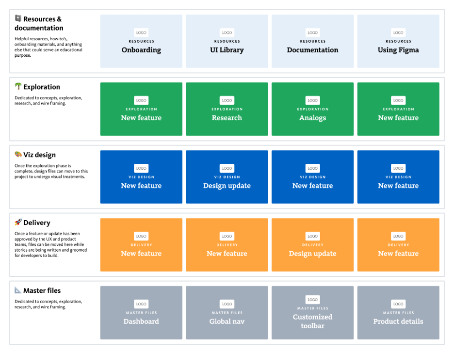
- There are many ways to structure your file organization, but as a product team with new features constantly on the roadmap, we decided to model our structure off of our process. We used projects to organize our files depending on where they fall within the process: exploration, visual design, dev handoff, and master files, with files shifting from project to project as they move through the process.
Swapping design tools is a huge undertaking and should only be considered when the potential benefits are worth the disruption. We didn’t take this Figma transition lightly. But with the support of our fellow designers and forward-thinking leadership, we were able to navigate this transition to Figma and see great results on the other side. We think you can, too.
Are you interested in what a Figma transition could look like for your product design team? Let’s chat!

