Designing Paths Of Least Resistance (& Freestyle Skiing!)

One night during the winter Olympics, my crazy neighbor Steve called me around 10PM, all hopped up on watching freestyle skiing. He yelled “What the [bleep]‽ Who the hell invented moguls‽ What the hell were they thinking‽” while leaving me a voicemail (by the way, dig those funky interrobangs—you learn something new everyday).
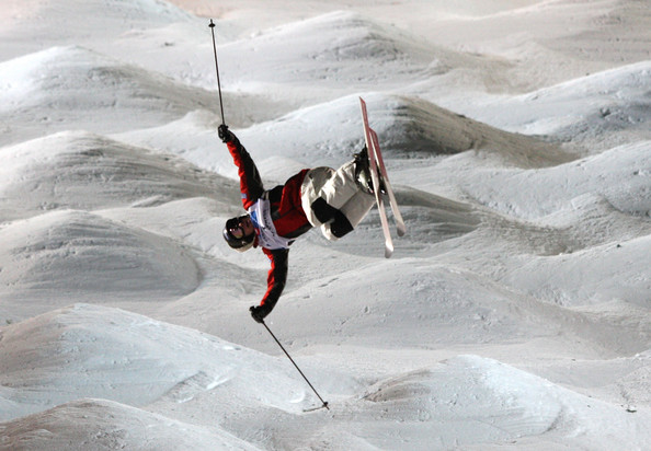
I laughed in agreement the next morning when I picked up his message. It must look like a crazy sport to the casual observer…what with the skiers’ knees bouncing vigorously up and down at ridiculous speeds, and then launching into potentially break-neck aerials. I laughed knowingly because I once was a competitive freestyle skier—and we didn’t even wear helmets back then! The event has changed since it debuted as an exposition sport in 1988 Calgary Olympics, but the design of a key component—moguls—has not.
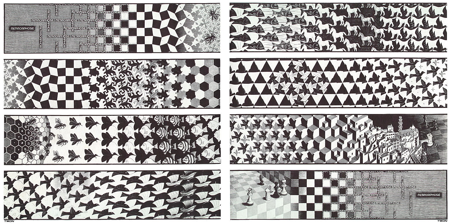
“Natural” moguls are created by a combination of Mother Nature (who provides the mountains and snow) and a wide variety of users. Take a steep (22°–32°), 200- to 270-metre (660- to 890-foot) ski slope and add skiers with the need to slow down by turning. Sprinkle in a variety of skill levels, shapes, sizes, bravery, aversions to speed, and equipment and they’ll build you a mogul course in a number of hours. However, if all of the skiers turned the same curvilinear shape at the same speed in the same direction, a mogul course could end up looking like an Escher creation.

But freestyle moguls are an Olympic sport because of the variety of the course and the different paths each competitor takes. Some skiers make short turns at slower speeds while others ski faster with longer turns, thus creating a complex set of options and making the sport even more challenging and exciting to watch. One skier turns tight and hits the first available jump, and the next may not.
Originally, skiers would launch into aerials off the more significant bumps at their discretion, yet most Olympians today have to take the same path and launch off a limited set of man-made jumps. This reduced variability no doubt makes the job of the judges easier, but it potentially makes the skiers’ job harder because they don’t get to make choices based on how they ski—they have to adhere to how the course designer believes they should ski.

Like humans interacting with most “interfaces” (natural or otherwise), most skiers, competitors, and users tend to take the path of least resistance. However, that path may vary based on their level of experience/expertise, the obstacle they’re faced with, and their personal preferences.
Inspired by Design by Nature by Maggie Macnab, I realized the similarity of the mogul course to the interfaces we design and validate everyday at Think Brownstone. We often create multiple ways of navigating applications and sites, with a standard path of least resistance we expect most users to follow. However, users don’t always find the path we expect them to use. Luckily, usability testing can uncover those disconnects.
I experienced this divide during some recent usability testing where I was validating the navigational elements of a new design. The new, streamlined landing page looked clean, uncluttered, and attractive, and included a drop-down menu with a little arrow to indicate the ability to make selections for navigating between functional areas of the site.

However, when I asked users how they would get back and forth between pages, they kept deferring to the good old Back arrows on the browser and completely missed the little drop-down caret that had been provided. Since most of us have navigated the web with browsers, we know we can rely on the trusty Back button: sometimes assumed to be the path of least resistance.
Although the small caret didn’t turn out to be intuitive as represented in the draft design, users succeeded in achieving the goals I had to challenged them with by using the browser’s back and forward buttons—so it became about optimization of the workflow(s) and visual design choices, and providing more intuitive paths of least resistance. But will some users still use the “training wheels of navigation” in the form of Back buttons on the Browser? Sure, and we should be aware of how the experience holds up when they do. In design by nature, or by a sophisticated user-experience architect, it’s important to allow our diverse user populations to carve out their own paths of least resistance—and always keep in mind that whether they’re politely skiing your suggested path, or rocketing down the slope on a toboggan with no regard for where predecessors have gone, it’s our job to keep them out of the woods.


