Cool ≠ Useful
If you’re anything like me, then whenever a friend sends or posts a message that says, “this is cool…” you follow the link. And if you’re anything like me, you spend a lot of time playing with cool things on the interwebs, eventually forwarding them on to other friends until it grows faster than Heather Locklear’s recommendation for Faberge Shampoo.
Here’s the thing we all seem to forget: cool doesn’t always mean useful. Cool just means cool. Cool is relative and difficult to measure while useful is easier to recognize. Those of us who like to build things that are useful like to believe that useful is universal, but that’s not always the case (see Charron v. McIntire).
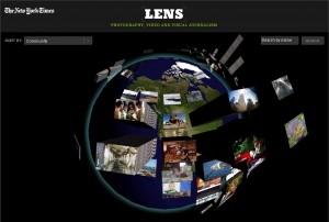
To me and the friend who forwarded it to me, the NYT interface for looking at images and videos from news feeds is cool, but its usefulness eludes me. Ignoring the bugs I discovered with the search field on the right, I’m not really sure when I’d go to this for a purpose. I go to it to play, and I have fun. Then, when I want to find an image about a specific news story, I use a well crafted image search tool like Google or Bing. Why? Because they fulfill my need in the most convenient way. If, someday, I have a need to see the frequency and location of images on the earth, I may go to a globe-based navigation tool. For now, it just adds a cognitive and psychomotor load that I don’t need. Don’t get me wrong, I still like to spin the globe and play with the stacks of photos, it just doesn’t fulfill any needs of mine other than entertainment.
A whole host of UI and UX companies out there have elaborate navigation systems that show off the design and flash-coding skills of their staff. I’m not going to point out any because that’s not our style here at Think Brownstone. They’re easy to find, I’m sure you’ve seen them, and once again if you’re anything like me, you’ve said, “Hey, that’s cool!” and forwarded it on to a friend. The problem with those fancy navigation systems is that they may impress your friends and attract the attention of a client or two, but are they doing anything to help your users?
One of the fundamental principles of design is to focus on goals: in the UX world these goals are most often Business Goals and User Goals. The designer’s job is to address those goals. Period. If you have determined that one of your goals is to provide entertainment, then the “cool” types of interfaces that require users to invest time to learn how to interact and explore for content are legitimate options. If not, then all you’re doing is appropriating your user’s time and they don’t like that. No matter how good the content is, if you obscure it, they’ll go somewhere else.
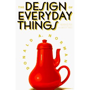
Don Norman likes to use the impossible teapot to demonstrate Cool v Useful:
If you’re a child of the 70s and 80s, think of it this way: you spent hours on end in a shady arcade somewhere navigating the mazes of Pac-Man (with an all Rush and Van Halen soundtrack, natch). It was entertaining. It was cool. In fact, it was so cool that a few days ago Google celebrated the 30th anniversary of Pac-Man by putting a working version of the game as the banner on their search page. Hours of productivity were lost around the world. Google drew even more traffic to their site.

If Google Pac-Man was sooo cool, why didn’t they force you to clear the maze to conduct your search?
Because Cool ≠ Useful

