Object-oriented UX (OOUX): process, examples, and resources
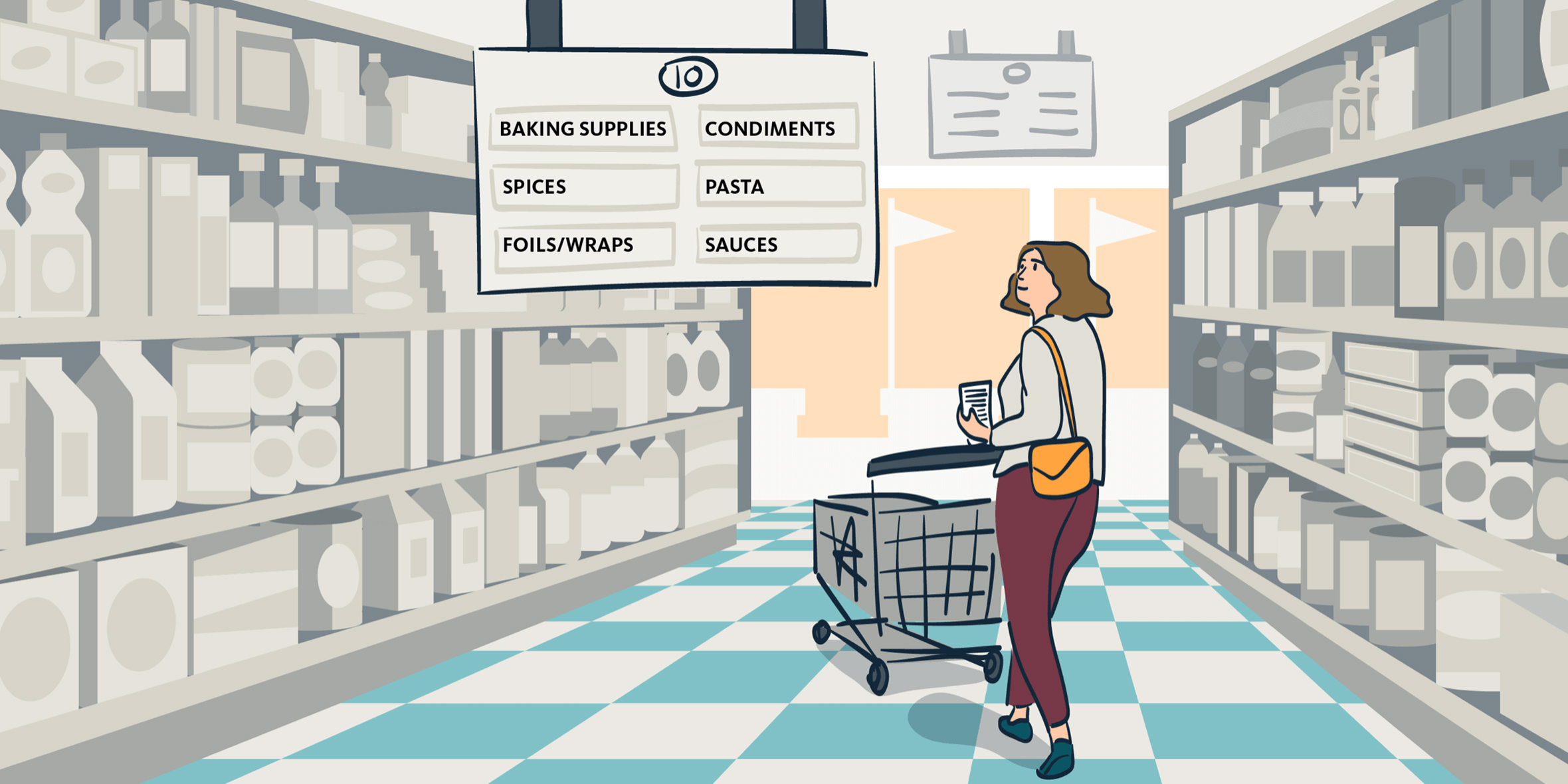
In the digital world—much like the physical world—we’ve learned to expect certain wayfinding points in order to locate the places, products, services, and information we’re looking for. In digital spaces, we call the process of planning this system object-oriented UX (OOUX).
In physical spaces, this system is similar to what you’d find in a grocery or retail store. You’ll look up for aisle signs or section markers that serve as broad menu items. You’ll also hope to find objects by looking for other, related objects: the vitamins are near the pharmacy, and the milk is near the cheese. These categorizations often depend on shared understandings and context.
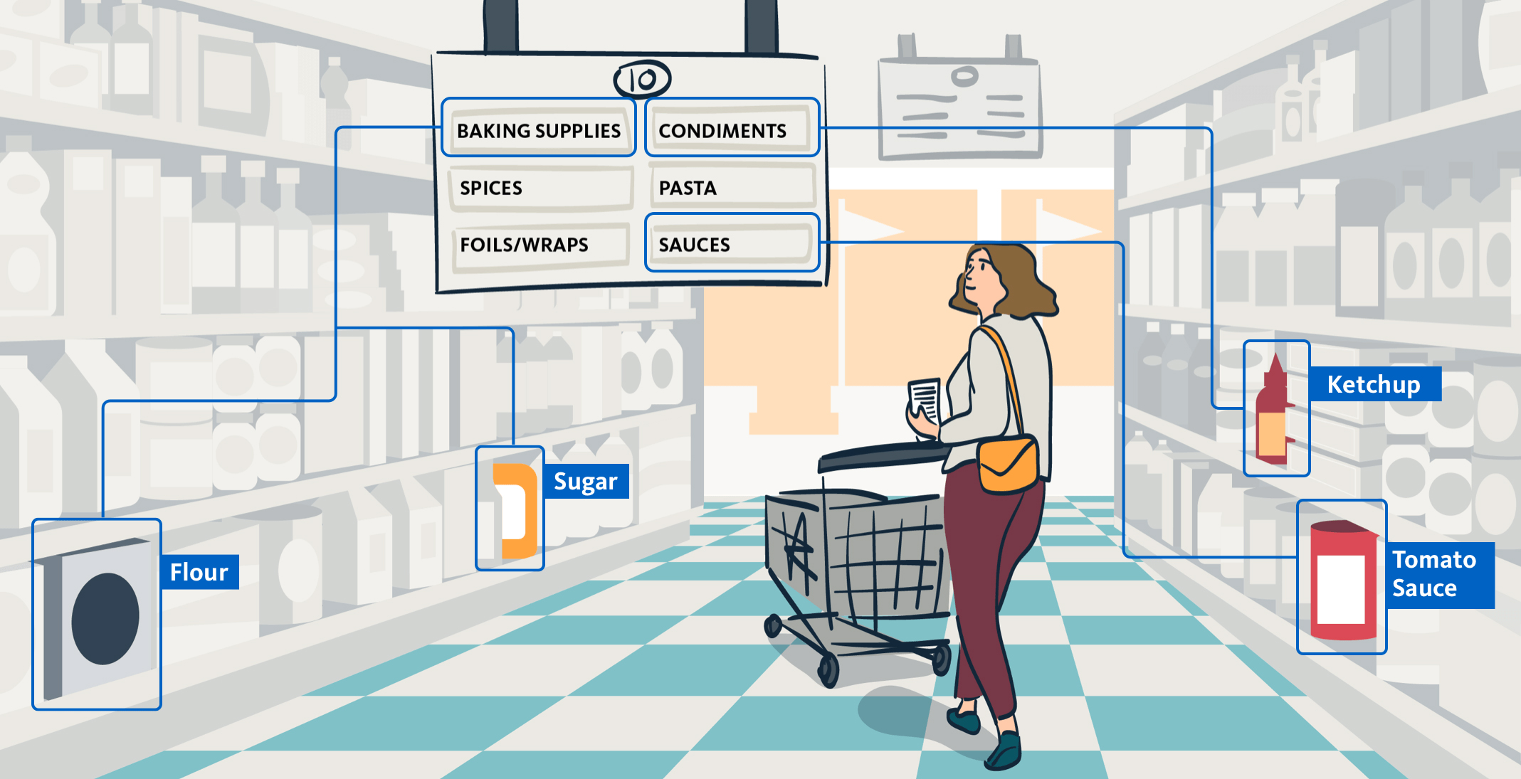
Ultimately, thoughtful OOUX can be a large contributor to the experience of your customers—often making their ability to find what they need using digital tools frictionless and free of frustration.
Below are the overarching topics I’ll address in this article:
- What is Object-Oriented User Experience?
- Why is Object-Oriented User Experience Important?
- Steps of Object-Oriented UX Planning
- Object-Oriented UX Example
- Object-Oriented User Experience In Programming
- Additional Object-Oriented Tools and Resources
- When to Use OOUX
What is Object-Oriented UX?
Object-oriented user experience (OOUX) is the process of planning a system of interacting objects and information within your website, app, or digital tool. OOUX helps us organize a navigation that is circular and contextual by defining associations between things—creating a “spiderweb” structure rather than a linear, tree-like navigation. This system also works to promote heterarchies over hierarchies. A heterarchy is a system of organization where elements are unranked, and therefore possess the potential to be ranked in an infinite number of ways.
The spiderweb framework is a form of information organization that asks us to define the “things” (often nouns) that make up our digital system—prior to organizing them online, or even wireframing. It also requires us to think about how our customers have developed “mental models” around objects and information. For example, do our users believe that bananas are more similar to pineapples than to plantains? Why is that? OOUX asks us to question the uniqueness of a digital object, and to think about all aspects of an object before assigning an action to it (edit, manage, pay, compare, search).
Why is Object-Oriented UX Important?
In the physical world, it is harder to hide poor inventory management and messiness. If you walk into a clothing store, for example, and a sign for the dressing room leads you in the wrong direction, you’ll likely feel frustrated. But in the digital world, we can conceal a multitude of sins: bad data, partially-loaded components, dead-end links, outdated visuals, and duplicate pages, to name a few. This bad digital management often leads customers to wonder, “am I in the right place?”
We get away with a lot of poor digital organization because we tend to treat the main navigation as an escape hatch that can reset the experience and bring the user back to the starting point again. And yet, more and more, we deprioritize navigation by hiding the menu within a hamburger or drawer.
In our digital tools and services, OOUX can benefit businesses, customers, and employees in a number of ways. This process can:
- Help customers and employees find what they are looking for quickly, improving customer experience
- Align objects and information with users’ already-established contextual associations, eliminating friction
- Help customers to use navigation to explore content, and not as a way to reset their experience when they get lost
- Help improve your digital “storefront”—giving customers and employees the impression that your products and services are high quality
- Help your internal team to make better decisions about the organization of information
When to Use OOUX
Use OOUX when there are too many objects to force a hierarchy, or when a system is incredibly complicated and may include constantly-shifting situational contexts and desires. Remember: both of these will require a flexible heterarchy that thrives on:
- Spiderwebs over tree branches
- Circular and contextual design
- Associations between things
We have used the framework to redesign complex call center customer service interfaces, a custom CRM for a pharmaceutical company, a small-to-medium business multi-location networking and billing dashboard, and for grantmakers who sought better ways to organize their public health data. The OOUX process helped us to both simplify existing systems and to design for new complexity.
Object-Oriented Design Approach
While OOUX can seem complicated, the process can be broken down into a few digestible steps. Consider the outline below to help your user experience design team get started on using OOUX to group and organize objects and information.
1. Extract Objects
Objects are the nouns that people talk about or need in order to use a product. We can collect nouns from our purpose statement, from user stories, or from business goals. It’s best to collect from all three.
We can also discover nouns by listening to user research—particularly things like in-depth interviews. Tag or write on a whiteboard any time you hear a noun that’s related to use of the product. These nouns help us to uncover the user’s mental model—they way they describe our product back to us.
We also rely heavily on user stories when populating nouns. User stories are short, simple descriptions of a feature told from the perspective of the person who desires the capability, usually a user or customer of the system or tool. We’ve found the following prompt to be particularly helpful as OOUX User Story Mad Libs. When beginning to “extract nouns,” try to fill the exercise out at least five times—thinking of different use cases and scenarios.
As a ____________ (type of user), I want to __________ (specific goal) so that ___________ (specific reason).
We can also gather nouns from your product’s mission statement. For example, let’s pretend we are designing a platform that helps florists to source fresh flowers from local farms in their region. In the aforementioned sentence, the nouns would be “platform,” “florist,” “flower,” “farm,” and “region.” Already this tells us a lot about the central focus of our product. These are your initial objects.
For now, just worry about creating the initial collection of nouns. We will whittle and prioritize later.
2. Define the Content for Each Object
In this step, we are forced to define what makes an object unique. What makes a flower, a flower? What gives a noun its “nounness”? What is the object’s key data and information?
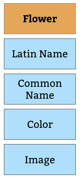
In our example, one of our objects is a “flower.” In speaking to florists, they (hypothetically) mention to us that flowers each have casual names and latin names. Some of our florists know flowers by their latin names, other florists only use colloquialisms. For example, the common name “daisy” can actually refer to 22 variants of daisies. But our florists most often use the name “daisy” to refer to the lawn daisy, latin name Bellis perennis. We learned a lot there—we learned that in order for flowers to make sense to all florists, they need both the Latin Name and Common Name for disambiguation. That’s already two core pieces of content.
Our florists also tell us that color family is very important when choosing flowers for a client, and that they like to see what the flower looks like to make sure they’re selecting the right flower. So already we know that a flower, as an object, needs the core content of “latin name,” “common name,” “image,” and “color” so that the florists can make a selection. Continue to build this out per object.
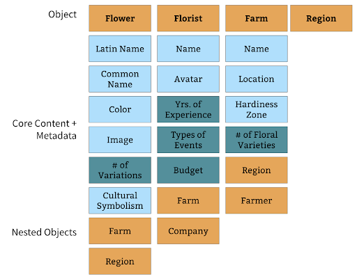
All main objects contain core content, metadata, and maybe other nested objects—a piece of core content, but also a distinct object. As we begin to speak with our users, listen to our user research, and speak to our business stakeholders, we can start building out the objects more completely.
3. Cross-Link or Nest Objects and Create Associations
To figure out if something should be nested, ask yourself: does this object need a relationship with another object for context? Can it exist by itself, or should there be overlap? Watch your associative system come to life! Infinite paths to finite objects.
Soon we’ll notice that a flower has unique core content, but it also has relationships to other things. Other “nouns”/”objects.” A flower can be found on a farm. A farm is its own unique object. So, we’ll cross-link or nest those two objects. A user would thus be able to navigate to both a farm or a flower individually, and a user will see that the two are related within our designed modules. But the object in which the user chooses to enter, the path they decide to take, gives them the context they immediately need.
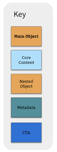
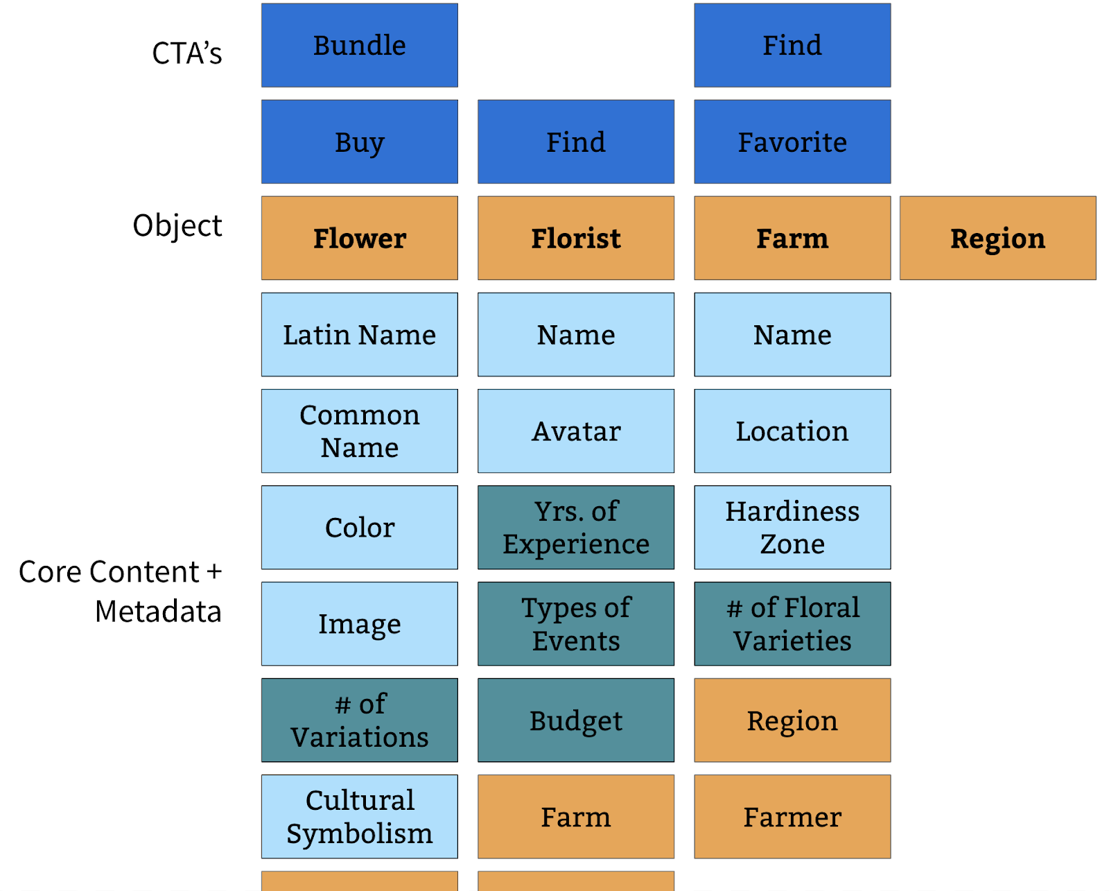
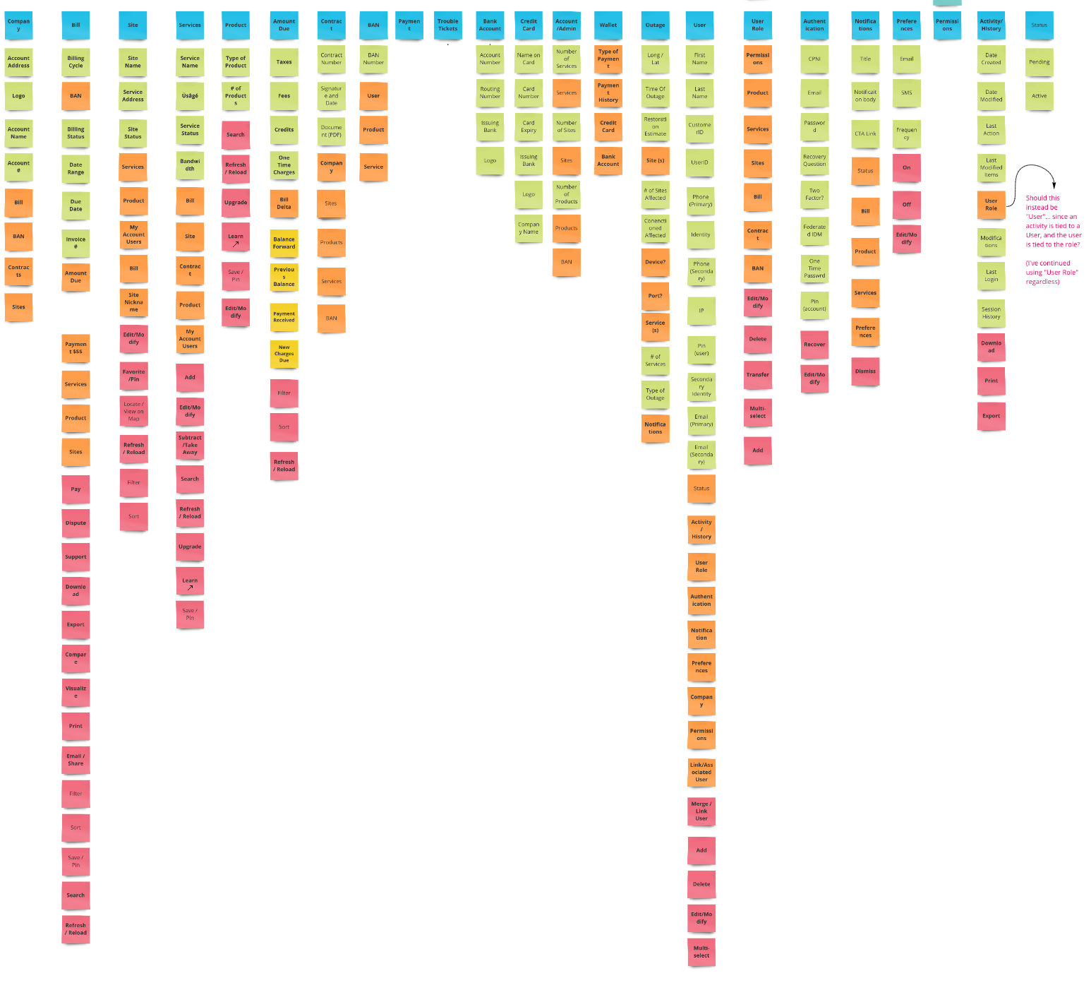
In our example, core content—like text and media—are light blue. Metadata—any fields or pieces of information which a user might need to sort or filter—are greenish blue. Objects are always orange, nested or unique. CTA’s (verbs and actions) are deep blue.
Our version of OOUX also includes optional permissions (identity management and access control) and states. Objects can be different if a user is logged in (authenticated). They could have access to more types of core content or metadata. The same applies for permissions: objects can flex their content (or disappear entirely from the system) if a certain type of user doesn’t have access to it.
4. Add Actions/Verbs to Each Object
Next we make sure our system is actionable. Without actions, a product is flat. We can uncover actions based on business goals and requirements. Remember, “We are designing a platform that helps florists to source fresh flowers from local farms in their region.” Just from that prompt we know that we need to help a florist “source” flowers. We also know that we need to help them geolocate farms. For something to be “local” it needs to have been located.
We can also uncover actions culled from latent user needs discovered during qualitative research. If many florists say something like, “I wish I could automatically repeat purchases from my favorite farms,” that tells us that maybe we should consider adding that action to the product. The action being “automic order” or “recurring order.” What are people hoping to accomplish in the product? What can be done in the natural world? Here are some things that we might be able to do:
Check availability of the flower at a farm
- Locate a farm
- Bundle many flowers for a bulk discount
- Find a florist
- Favorite a farm
- Favorite a florist
- Buy the flowers
- Ask a farmer a question
5. Prioritize Object Modules, Keep Them Centralized
At this point, the team has created an inventory of the objects. This is a form of a site map, or a module map. It contains all the important objects in the system. It’s a place to reference definitions of things. What does a “farmer” mean to us? What does a “region” mean? This should be the “one-map-to-rule-them-all.” A central place for designers, researchers, and developers to understand the plane of your product. The beauty of this shared repository is that when a single object is changed, everyone is aware.
Prioritize which objects must be designed first, which objects are most important. Challenge yourself to figure out which objects will be most important to your users. Below is just one example of an object map that our team has worked on for a product. Some may have as few as 6 objects, and another as many as 30. This module map becomes our “requirements to design.”
We can start to wireframe what these modules will look like because now we know what they should contain. You can even treat the Post-It’s as a clickable (ultra lo-fi) prototype of your system.
6. Design, Build, Deploy, Test, Iterate, Add, Subtract, Repeat
As daunting as it sounds, our work is never truly done. As real users begin to interact with our system of navigation, we will figure out what works and what does not. We will add objects and core content. We will subtract objects and core content. We will test objects. Your module map is an organism that will change over time.
“You never actually own a Patek Philippe Object Model. You merely look after it for the next generation”
Object-Oriented User Experience In Programming
Through OOUX, a designer or researcher can better communicate with a developer. That’s because the artifacts created during the process are documentation of relationship maps, names of modules, and definitions of an object. This allows the developer to better see our intent, and to better understand the product we’re building. They won’t have to abstract and work backwards from flat visuals.
Let’s break that down into more accessible examples. We often design “verb” first without realizing it. This is akin to designing a task flow or a pure user story.
- We posit, “a user needs to pay a bill” or “a user needs to edit their contact information.”
- “Pay” and “edit” would be the verbs. And they are the focus of these tasks.
- We designin a clear, prioritized path. The “blue sky” route. The “happy path.”
The problems with this way of thinking are myriad. We deprioritize the experience when a user “goes off path.” We assume that tasks are linear, when in fact the world is associative. We forget about the bill itself. Many things can be done to a bill. We can “pay it,” “dispute it,” “compare it,” “download it,” and so forth. We miss opportunities for natural actions.
By designing one flow at a time without having mapped out the entire product offering at the beginning of the project, we can easily overlook certain opportunities or places to seed content. Then, as new features get introduced to the product, the designers need to shoehorn things into existing interactions and screens. By designing around “objects” rather than pages, we can break down barriers that we needlessly put in front of our users in their search for information. What must “contact information” contain? What must a “bill” contain? Are all elements within those things unique, or are they needed in many parts of the experience?
Applying Object-Oriented UX in Design Thinking
In OOUX, we are more interested in the objects in the system. What are all of their properties? Do all objects share some of the same properties? Do some objects have unique content, distinct from others? How many objects should the system have? Is the object part of something larger—like how a sock is both a single item, and a part of an outfit? In what ways can we connect one object to another?
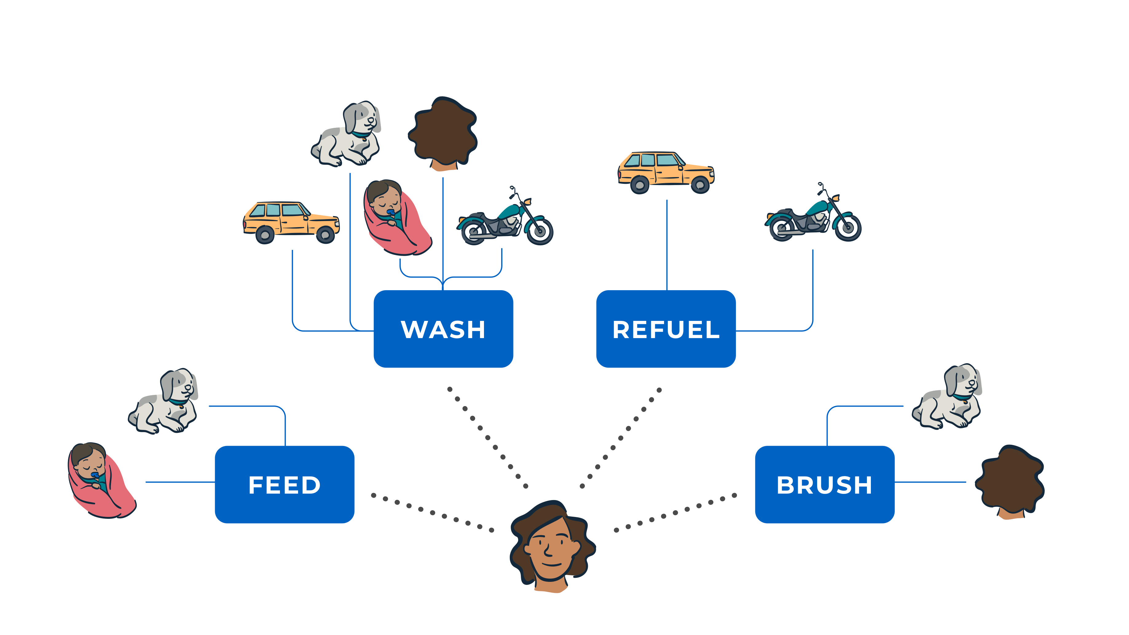
Imagine if you owned a car, a motorcycle, a dog, and a home. Add to that scenario the fact that you must provide for yourself and a small infant. These are the objects in your life. If people were to think action first, they would have to say something like, “Today I want to refuel.” And then, based on that action, they would be presented with a menu of objects which can be refueled: the car, the motorcycle. “Today I want to brush.” Menu of objects: dog, baby’s hair, my hair. “Today I want to wash.” Menu of objects: motorcycle, home’s windows or siding, car, my hair, my baby’s hair, my dog.
This method of organization creates redundancies in your objects. It’s a slow system that requires you to recall any object you may own which may fit the need for an action.
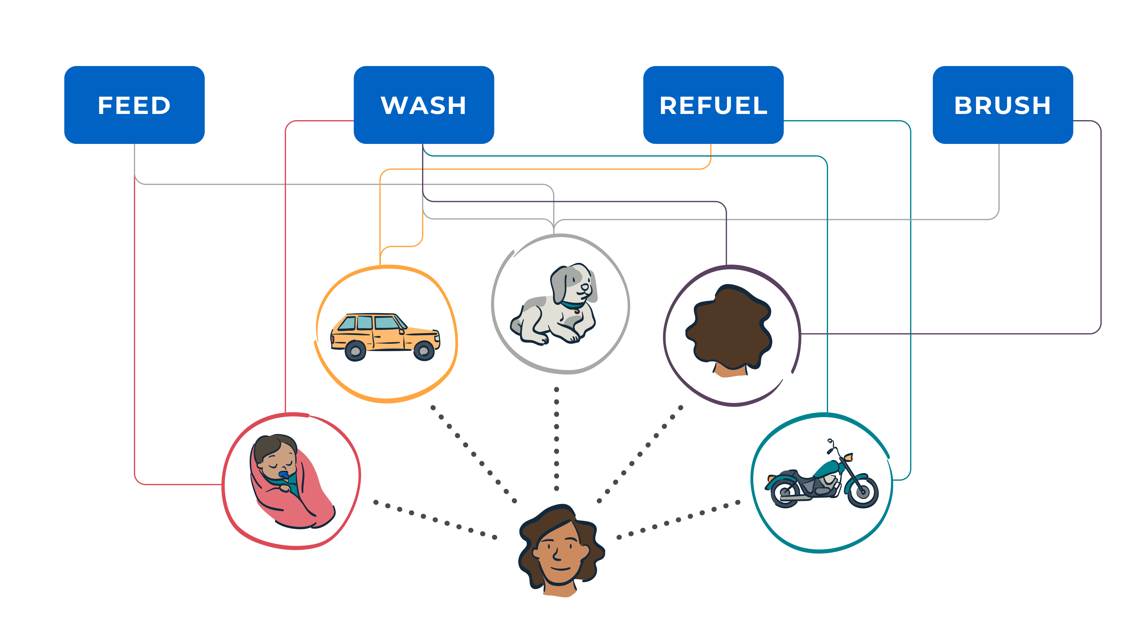
But, if there were a shift to the frame of thinking to move from actions to objects, the organization and connective fascia between the objects in life would be more easily understood. I have a baby. My baby has teeth. My baby has hair. My baby has skin. My baby has hunger. Because my baby has teeth, hair, and skin, those elements need to be washed. Because my child has hunger, it needs to be fed. I only need to reference the child once to view all of its potential actions. To see all of its content.
Because there are so many objects in life, and all of them are important, it’s hard to force a hierarchy. It would be hard for anyone to decide which of these objects inlife has the highest priority. Object-oriented UX helps us to allow for this kind of situational prioritization. It offers flexibility in organization. It assumes that our relationship with objects are not static, and helps us to better suggest next steps to our users.
Object-Oriented UX Resources
We stand on the shoulders of giants and I would be remiss not to include these learning resources and places of inspiration that informed my method of OOUX:
- “Modeling Structured Content” by Mike Atherton (IA Summit 2013)
- “Designing Web Navigation” by James Kalbach (Chapter 4, “Types of Navigation”)
- “Designing Object-Oriented User Interfaces” by Dave Collins
- “10th Annual Euro IA Summit Closing Plenary” by Abby Covert
- “A World Made of Information” by Abby Covert
- “What is OOUX?” by Elizabeth Kim
- “Untangling Wicked Digital Problems” by Lola Oyelayo-Pearson
- “Object-Oriented UX” by Sophia Voychehovski Prater
- “OOUX: A Foundation for Interaction Design” by Sophia Voychehovski Prater
- “Content Everywhere: Strategy and Structure for Future-Ready Content” by Sara Wachter-Boettcher
Here’s a Google Slides deck that will walk you through the “Florist and Flowers Purchasing Platform” OOUX example. Feel free to make a copy and play.
Object-Oriented UX Improves Your Design Approach
By using an OOUX process, you’ll not only become better at thinking about customer needs and mental models in the context of the products and services you offer, but you’ll also greatly improve the digital experience your organization can provide for customers and employees who rely on your tools. Customers may not go to a competitor if they can find what they need from your organization—with more speed, ease, convenience, and delight. Employees can work more efficiently if your tools help them focus more on work and less on the digital workarounds they need to create in order to do their jobs. And your user experience design team will create a better digital infrastructure in the long run—helping you to avoid messiness and create a storefront that is organized, clean, and leaves the right impression.
Want to learn more about the latest in design and technology leadership? Sign up for the Think Company newsletter.


