The last mile in website security: usability

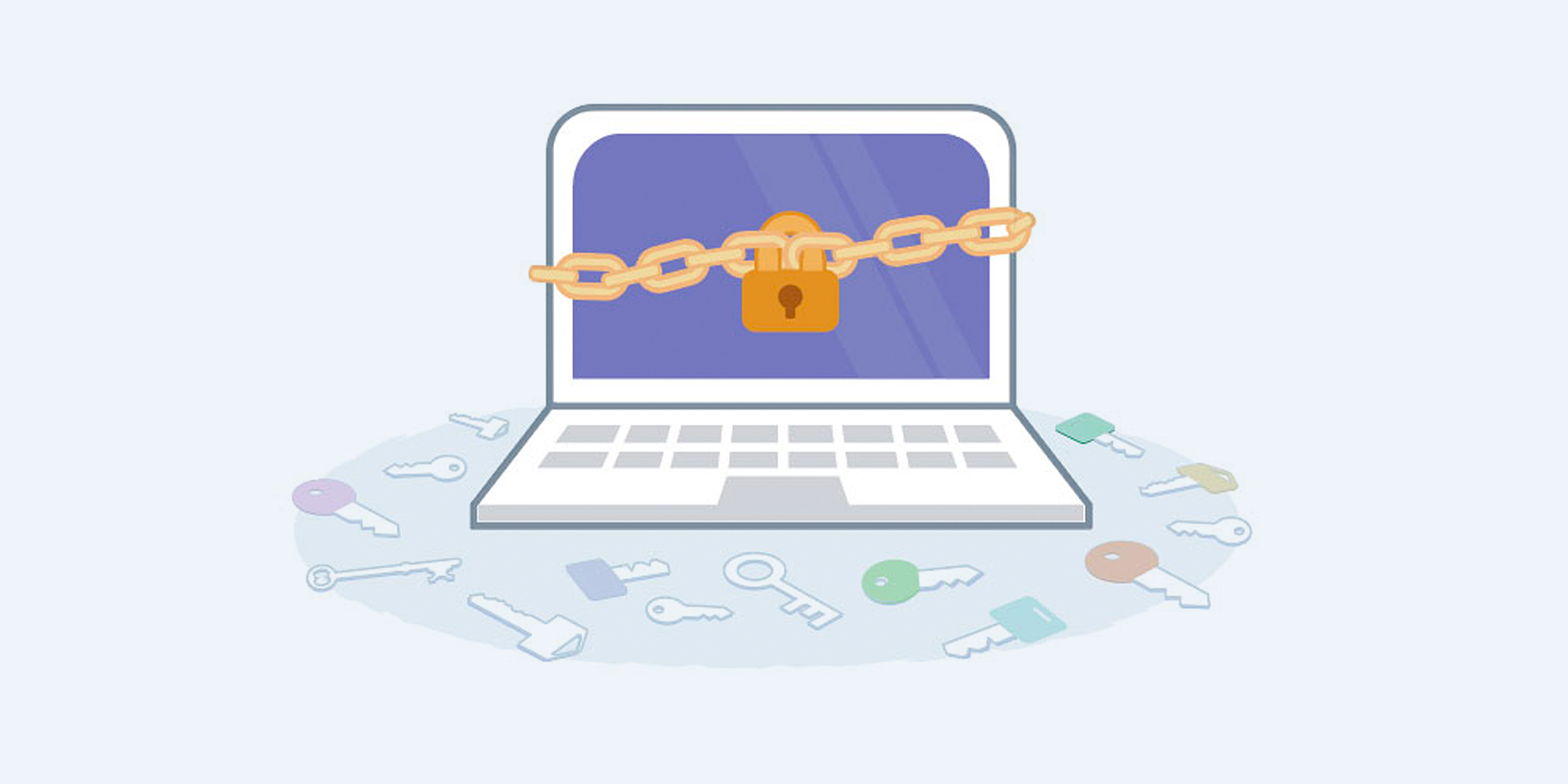
A thousand critical details go into making a website secure. But we often overlook the most critical piece of security: usability.
“Security at the expense of usability, comes at the expense of security.” – AviD, user on Stack Exchange
Think about all the times you’ve seen someone write down their password and stick it on their monitor. If the best security is too hard to use, people will look for ways to bypass it. The best security is the security your users will actually use.
Here at Think Company, we spend all day every day thinking about your users’ experience, and security is a big part of it. Here are some of our thoughts about the interface between security and usability.
Be aware of reused passwords
The average person has roughly 27 logins to remember. Your most security-conscious users have a password manager to make sure that each password is unique. But not all of your users are that security-conscious. Many of your users reuse the same password multiple times—and attackers are smart enough to know this.
Consider using two-factor authentication
With two-factor authentication, the password (“something you know”) is backed up by a device (“something you have”). This adds another step for your user, but that step is much easier for them than trying to create and remember yet another password.
Help your Users Understand Where their Content is Being Displayed
Most people are unaware of how sensitive the content they put onto the internet can be if that content isn’t used in the way they were expecting.
Something as innocuous as a vacation beach photo could be worth thousands to a thief who now knows that that user is away from home.
For victims of domestic abuse, the consequences can be far more dire. A person might be living in a different state and using a pseudonym, but it’s possible that a “suggested friend” algorithm could surface their profile to users they’re trying to hide from.
Make sure you provide your users with enough information to fully understand where and how the content they post is being shared.
Provide granular controls so that they are able to easily decide who can see what. It should be easy not only for someone to hide any information they don’t want shared, but also to block and report any sort of abusive or harassing behavior.
User-test Your Interfaces to Find Security Leaks
Even the best, most powerful privacy controls aren’t effective unless users understand how to use them and what the defaults are.
If your site or app is using a new type of interaction or technology, make sure to educate your users on exactly how it works. A few slides clearly showing some do’s and don’ts can go a long way in protecting someone from embarrassment.
Test your new features before releasing them to make sure that your users are interacting with the controls in the way you expected. Do they understand what the defaults are? If they want to hide a particular piece of personal information, are they able to do it?
Good Security Design Is Great for Business
Netflix, Hulu, and Spotify have all planned for usability design with security in mind in a way that isn’t immediately apparent. The family plans they offer are actually a security feature in that they reduce the number of people sharing an account—all by offering an option that only costs a little bit more while still offering individual logins. This individual login approach protects users from giving out a password they have probably used elsewhere. It also reduces the number of unregistered users on the service.
This is a huge benefit for both the business and their customers.
Practice Defensive Design Thinking—and make it easy!
Security doesn’t have to be a hurdle for users and can actually be part of a good user experience. There will always be unknowns when dealing with complex systems that use algorithms and machine learning, but practicing defensive design thinking can make the experience better for everyone.
Security is everyone’s responsibility, from the CEO all the way down to the end user.


