From Notes to Pixels

When people ask what I did before UX design, they are usually surprised to hear that I was an orchestral conductor. What’s even more surprising to them is that the core skills of a conductor and a UX designer are nearly identical.
That’s right. I was the guy on stage waving my arms through the air while a group of talented musicians played on stage and made me look good (… usually).
But a lot of work would come before that moment.
SIMPLIFY
I remember sitting at my desk for hours studying the great works—the Beethoven symphonies, the Mahler symphonies, and so on. I had a few main goals in my study. First, understand and simplify. I had to understand how all the details in this piece fit together into a single, meaningful whole. But this is no small task.
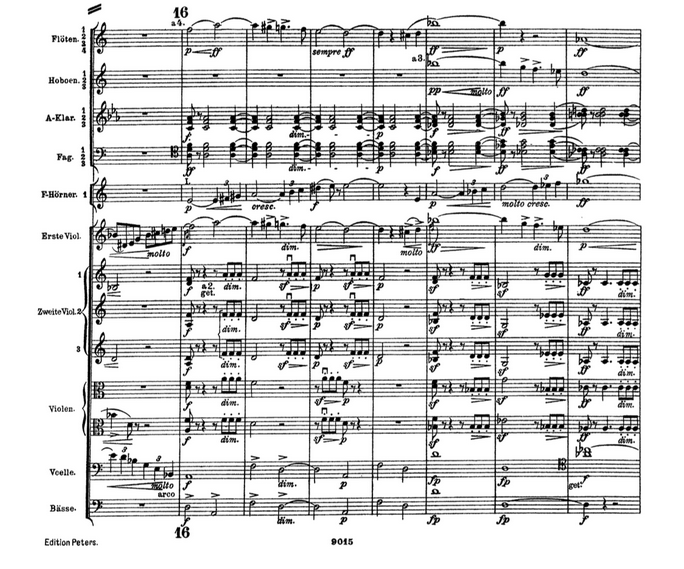
Every marking has significance. If you’re not familiar with classical notation, the markings are not only notes and rhythms, but also stylistic markings (how loud or soft, whether to play short or long) as well as a slew of German terms describing the pace and emotion Mahler envisioned.
Understanding this music involved quite a bit of research and analysis. I would look at this musical “data” from many angles—harmony, melody, structure, tempo (the speed of the piece), the history of the piece, the motivations behind its conception, history of the composer, and the list goes on.
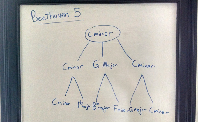
This effort often involved some sketching—like putting together a simplified version of a harmonic analysis to display a few hierarchical layers of the harmony.
The point is to see that the “home base” key is C minor, then the next layer is C minor, G Major, C minor, and so on. (Perhaps the idea is familiar to some of you?)
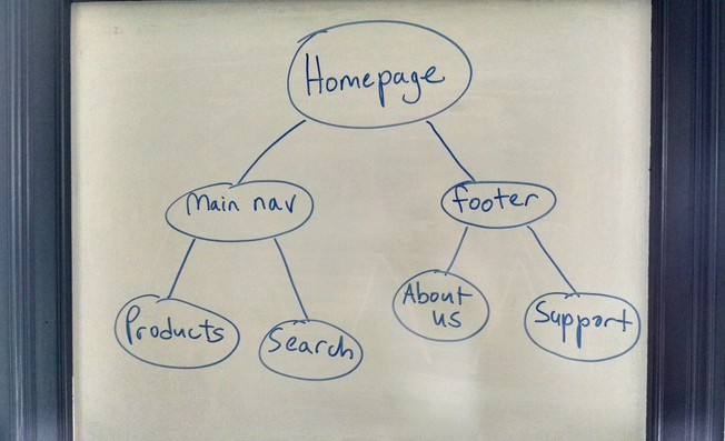
Little did I know, my sketches for the great symphonies were preparing me for common UX analysis practices, like sketching a baby site map.
In both cases the goal is the same: to create an abstraction of whatever you are analyzing to see how the parts fit together as a larger, simpler whole. It’s like looking at the information through a series of “lenses” until patterns start to emerge. This idea became integral to my work here at Think Brownstone.
EMPATHY
My second goal was empathy. Equipped with a thorough understanding of the piece, I was now in a position to step inside the shoes of the orchestra members to make the piece accessible and engaging for them.
This happens on a number of levels; one is emotional. As I stood in front of the orchestra, from the moment the first violins picked up their instruments, readied their fingers, reached across the strings, and drew the bow, I imagined myself doing that same action. This is what makes physical gestures on the podium meaningful. They are just an extension of what the musicians are already doing, or what the conductor wants them to do.
For example, if I wanted the orchestra to play short, I’d make a quick, abrupt motion. This magically “makes” the orchestra play short. Why? Empathy. They are mimicking my quick, abrupt motions. Ideally, there is a tight relationship between the conductor’s gestures and the orchestra’s response.
Making this relationship work requires a deep knowledge of what specific players need and don’t need. Certain gestures can be counterproductive. For example, oboists don’t typically take large breaths like a trombonist would. So, if I cue an oboist and take a huge, trombone-like breath, that could make him or her uneasy. They’d have to ignore their instinct to empathize with the conductor in order to take an appropriately small breath. The more unhelpful a conductor’s gestures, the more the conductor becomes white noise—much like a cluttered, unhelpful interface or information architecture for a website.
After all of this effort, I had to listen to see if my gestures were getting the response I expected.
MAKING CONNECTIONS
This process of thinking through exactly what each person in the orchestra needs, and listening to see whether they are getting it, is very similar to what we do in interaction design and user testing. When designing an interaction or analyzing a workflow, we have to think through every step of the process for multiple user personas, down to a minute level. We carefully consider exactly what our users need and make sure those needs are accounted for.
How do we know our ideas worked? We have to test them. And we have to put our ideas in front of real human beings and see how they react. This can often be a humbling experience, just like conducting. Sometimes the gestures I thought would be effective—or ideas that I thought were simple—fell flat. The only way I could fully learn was to stand in front of a live orchestra and see what worked and what didn’t.
We often joke at Think Brownstone that we “peddle common sense,” and that the idea of creating experiences is inherent in all of us—you just need the road map, the determination, and, again, that special “lens” to see it. The process of coaxing a great experience out of a stack of sheet music, out of a periodic table of elements, out of a selection of architectural materials, or out of a digital toolbox is actually remarkably similar—and I for one can speak to that not only in metaphor, but in actual practice.

