The Cost of Not Focusing on UX? $170M
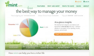
Our design team has been closely following Mint.com. From the very beginning we’ve been enamored by its “sexy” design: intuitive, clean, fun, and free. We’ve been equally impressed by its evolution and how each new iteration is better and smarter.
We’ve told our clients and prospects about the site and encouraged them to sign up. Most of them did, and it was always an eye-opening encounter for them. In fact, in a lot of ways it was a great proof-of-concept for us—it helped clients understand the importance of a great user experience and helped streamline the path we would take with them. It was a concrete example to use when warning them that if they didn’t pay serious attention to their users’ needs, one day two guys working out of their studio apartment might come along with a competitive product that would steal market share—market share that they were already fighting to hold on to.
Sure, that competitive product might not have as many features, but it would instead succeed based on the tried and true 80/20 rule: 80% of your users employ about 20% of your features; so instead of giving them every bell and whistle you can possibly think of (jack of all trades, master of none), carefully identify what that core 20% is and do it better than ANYONE else. That makes that 80% of your users (at least) very happy, who tell their friends, and before long the amount of users that make up that 80% has grown significantly. It comes down to this: all else being equal, users will pick that which is most intuitive, simple, and yes, pretty and fun. As mentioned earlier, figuring out how to make it “free” for them also ain’t too shabby.
Earlier this week, on the second anniversary of launching, Mint.com announced that Intuit (makers of the behemoth Quicken, among others) would acquire them for $170 Million. As the saying goes “if you can’t beat them, buy them” – and the folks at Intuit are likely thanking their lucky stars that they managed to grab hold of that nimble little nuisance before Mint.com completely left them in the dust.
The real gem in all of this is the fact that Mint.com made something exponentially better by making it simpler. We should probably get that printed up on t-shirts or something. Congrats, Mint.com—stay cool. Please.

