Mail Quotas, Shortcuts, & Other Horrors

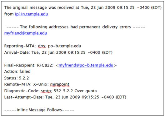
I just sent a message to a friend of mine who works at Temple University in Philadelphia, and received a reply with the subject “Returned Mail: Over Quota”.

O…K… that’s super helpful… maybe whatever is below “Inline Message Follows” will help me make sense of this? No, it’s blank beyond that.
1. Skip The Tech-Speak
So my first gripe is that this is a techy and jargon-heavy message that provides no context, direction, or value—it’s just a “dumb error message”. Most people might a) think it was spam and delete it or b) not have any idea what it was trying to convey, and in both instances might have no idea that the message hadn’t actually been received by the intended recipient. We all know that universities frequently deal with time-sensitive and confidential information, so wouldn’t it be nice to let the sender know what had happened in no uncertain terms? What is a permanent delivery error? What exactly does that mean? Why do I care? Something like this could mean the difference of an application being received on time or something even more serious. It’s unacceptable for that to be at the mercy of poor interaction design.
2. Beyond the Message, Look at the Vehicle
The poor messaging is actually somewhat beside the point because the sender of the message should never be the recipient of an e-mail like this. Why? Because they can’t do anything about it. If I send a message to someone whose mailbox is over its size limit, well, that’s on them. It’s not my fault, so why am I made to feel like I’m being shut out with what is essentially a “tough luck, kid”? What if I don’t have any other way of contacting them? What do I do now? If I’m crafty enough I might make a call to Temple to find a phone number or a name of someone else in the department that I might be able to contact… wasting my own time as well as those who have to route my call.
3. Mail Quotas? Seriously?
OK, Temple is a large organization and I guess I understand mail quotas on some level, particularly if students are on the same server and they’re sending large movie/sound files around, etc. But for business users to be hamstrung by those same quotas? Regardless, here’s a newsflash: as a user, I don’t really care what your technical issues are—the experience is all I know, and it’s not good. Storage is cheap these days, and getting cheaper… so this feels antiquated. But even so, I’ve worked with organizations that have mail quotas that are instituted much more intelligently: the recipient gets a message that their mailbox is over it’s limit, all messages are still received, and they simply can’t SEND any messages until they clean up their room. It’s still a little old-school, but at least it’s on the owner of the mailbox to fix it.
GRRRR.
This is just one of those days that poorly designed technology is infuriating me. Add the fact that I had to type this twice because during my first attempt I hit “Backspace” (I know, hitting Backspace while typing? I should be committed) and my browser decided I wanted to go to the previous page and erased what I was typing. Thanks, Internet Explorer! That was a helpful keyboard shortcut!
And how about when I went to a page earlier to demonstrate some functionality, started typing my username and password, and after a few seconds the page automatically placed the cursor back in the first field and exposed my password to the whole room?
As a designer, I know there are technical reasons these things happen. Let me reiterate: as a user, I don’t CARE. Enough apologetics. Fix it.
It doesn’t have to be this hard people. It really doesn’t.


