Falcon Waterfree Technologies Gets It

“As much as 5% of fresh water consumed is currently used to carry away urine. Each Falcon Waterfree urinal typically saves an average of 40,000 gallons (151,000 liters) of fresh water per year.”
Not much would be required beyond that quote to say that Falcon Waterfree Technologies clearly “gets it”. Read about them and their mission and vision, and you’ll also be thinking “yes, these are the kinds of companies that deserve to thrive and prosper”—and should they succeed, it’s going to make the world a better place for all of us.
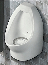
But wouldn’t you know it, they’ve taken it a step further and incorporated some great design as well. Sure, as far as urinals go, their products have some nice lines and are easy enough on the eyes—plus, no piping or anything that you need to touch with your hands (bonus).

But did you notice that little speck in the back of the bowl? That is, in fact, a little cartoon bee that is painted on the unit itself—and it is a brilliant example of iconography, universal language, and simplicity.
The unit is water-free after all, so to keep things as clean as possible and working properly it stands to reason that there are optimal ways to, um, “interact” with it. They could have created little instruction panels (bringing up language concerns) that nobody would read or certainly wouldn’t read until they were already in mid-relief. They could have done any number of designs like bulls-eyes or arrows or other things that were heavy-handed and might make people loathe to comply for just that reason (unless the consequences were dire) because we’ve all got a little bit of rebellion in us. Instead, they acted upon a piece of universal knowledge: guys like to aim at stuff.
There’s something about that bee, isn’t there? There’s no explanation, and no pressure. And it’s almost diabolically hard to resist aiming at, turning what would otherwise be total downtime into a simple game. Why does this matter? It guides the users to keep the urinal working more efficiently (proper aim reinforces the vortex that keeps the liquid moving down the water-free drain) – reducing maintenance costs, keeping things more sanitary, and improving the experience for everyone.
There are a few lessons here:
1. When all else is equal, something that offers people the chance to test their skill or have a little fun in an otherwise rote or mundane setting will likely be utilized.
2. If you exploit simple, innate trends and tendencies of your target audience, you can sometimes seamlessly (and even unbeknownst to the user) achieve better results than traditional methods of communication (text, audio, video, instructive graphics).
3. Not every design decision has to be beaten into the ground—sometimes it really is acceptable to just go with something because you have a visceral response to it or because it is “cool” (properly executed, of course). I’m sure there was research behind using the bee, but if it was a little hammer or one of those mushroom guys from Super Mario Brothers, I’m willing to bet the results would be the same.
Strong iconography that can be understood (or elicit specific behaviors) globally is something to strive for – I’d be pretty proud of this had I come up with it. To quote Brian when we were talking about the genius of this design at the Think Space (obviously, our inspirations know no bounds): “…that’s what is so brilliant about it…I mean, I think Europeans probably like peeing on bees too.”
Who wouldn’t, Mr. McIntire. Who wouldn’t.


