Traveling With A Designer’s Eye

In my short life I’ve had the pleasure of being able to travel around the world; my most recent pit stops being in Kenya, China, and Sweden. Each trip was an introduction to a whole new world, and a new way of thinking. But no matter if I was walking on a dirt path through a small village in Kenya or dodging traffic in Shanghai, I was still thinking about design. Specifically, how visual design was used in each respective nation. The world seems to sing Sweden’s praises, overlook Kenyan design tactics (mainly because there is an amusing lack of coherence), and snicker at quirky Chinese advertising.

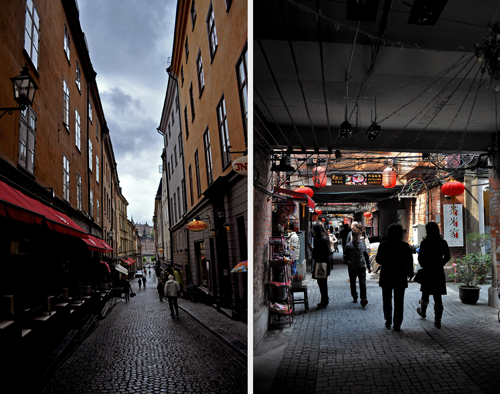
Let’s start from the north: Stockholm is an up-and-coming design hub. Their students are being snatched up globally for their design know-how and creative ideas. As I biked around the city for that wonderful week, I was astonished to see a lack of billboards, logos, or gaudy advertising on the classic architecture but design is there in great force. Found in stores, in underground malls, and around central hubs, advertisements surround you at street level. They are notably simple, subtle, to the point and hinge upon an innate understanding of good typography.
Kenya was quite a different story. The largest city in the country, Nairobi was littered with confusing visuals, coupled with a range of different languages and symbols. It was like the media in the city was designed by an “Intro to Photoshop” class (one ad I saw even used comic sans, gasp!). Interestingly however, the atrocities against design weren’t entirely the result of originating in a developing country, as many were found to have come from American and European run agencies. Case in point, I had the chance to spend three days at an orphanage in Kenya, a fantastic program that is really helping the children (I connected to this place and their cause so much that I decided to sponsor one of the children I worked with). When I got home, I excitedly Googled the name of the organization, clicked on their site, and cringed. A downright creepy work of art greeted me and the website was confusing and hard to navigate. It was apparent that no one had focused on the usability of this site or the visual flow.Who designed it? A freelancer from Washington state. If you can’t get work in the states, maybe you go where the bar isn’t (currently) set so high…
In Shanghai, if you look up toward the towering buildings, you are curiously greeted by a man smiling serenely down at you; he’s 20 stories tall and it’s an advertisement for…Xerox. But you can forgive the odd ads, which have seemly no correlation to the product, and chalk it all up to a cultural difference (one of many). What is admirable about Chinese graphic designers is the variation of fonts. You can only do so much to an 8,000-character alphabet but a few companies have set themselves apart by simply changing their font. No matter the differences in our cultures, Shanghai was, and is, visually magnificent – boasting huge glass skyscrapers, small parks, and some of the newest ad campaigns by large corporations.
One interesting thing was to see how large global companies advertised/designed differently across these three different regions. Take Coca-Cola for instance: while in Kenya, I saw many ads from them; bright, flowery, and silhouette-focused, they were some of the best designed. In Stockholm, Coca-Cola ads centered on high fashion, with stunning models in odd poses, holding cokes. Each city focused on a different campaign, I believe, because of the cultural focuses of each society. The strength in these ads is found in simplicity; if you’re walking down the street and you see a flash of striking red on the side of a building, your attention will be drawn. Personally, I believe that the simple graphic designs are more effective as a universal campaign. Designing well is a challenge to begin with even without running into widespread issues like handling different characters from multiple languages, addressing varying cultural spectrums, etc. But no matter what country, in which culture, good design is always valued (even if it’s not noticed).
Intern, out.


