Nate Silver Gets It: Elections, Data Visualization and Bias

A little over four years ago, I published my thoughts on statistician Nate Silver’s blog, FiveThirtyEight – which now resides at the New York Times. I am, as I was then, a little obsessed with political data. The current election season only feeds that obsession.
User-focused Data Visualization
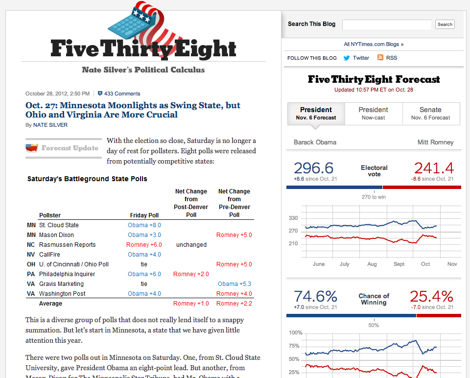
Back then, I had a few criticisms for Nate’s data visualization choices. While Nate opted to avoid chart junk to keep his charts and graphs simple, I felt that some of his design choices left the user with more questions than answers. Since Nate’s partnership with the New York Times, it’s clear he pulled in some serious data visualization and front-end developers to keep his charts focused, interactive and meaningful.
Since my initial review, I have worked through a number of data visualization projects and I’m here to say – making things simple is very hard. Good data visualization is a constant battle with Hick’s Law and the Tyranny of Choice. FiveThirtyEight’s current visualizations do exactly what they need to do for the audience they have chosen – no more, no less – and that’s a difficult state to achieve.
The graphs and tables at the top of the right-hand rail are what I would call a Dashboard View, providing an at-a-view glance of the data. The only additional functionality offered is a hover-state over some graphs to see the details of each data point and shadow areas showing each candidate’s range within the graph.
Now, a hardcore statistician working for either presidential campaign may want to manipulate the chart to see a longer range of data or to play with the model to add some of their own assumptions, but those folks aren’t Nate’s primary audience. Nate and his team wisely chose to leave that noise out of the equation. It was probably tempting for Nate or the developers of the charts to allow users to do more with what they saw. While fun and useful for a minority of users, those features would distract the majority of his audience from the purpose of the application. Imagine that – a beautifully simple design that is able to capture the essence of Nate’s enormously complex model.
The Right Tool for the Right Job
Designers often find themselves tempted to present data in a range of graph types simply to show variety. This flies in the face of why we have different graph types. Almost everyone understands a pie chart is meant to represent parts of a whole, but we quickly get lost in selecting bars charts vs line charts.
As you can see from FiveThirtyEight’s graphs, they aren’t as concerned about showing similar graph types next to each other. The line charts are showing the progression of data over time. Often, we see this type of data represented as stacked bars or side-by-side bars. Had Nate done this, the feeling of a head-to-head race would be lost.
Still Some Room for Improvement, Nate
That isn’t to say all of the visualizations make me swoon. The “Electoral Vote Distribution” graph is the one that has the most flaws in my mind. Scale is something we struggle with every time we are plotting data along a path. While it’s tempting to show the full scale of the data, data points can be lost in a sea of white space. Unless you are trying to prove that the distribution is even (which it isn’t right now) you’re better off making the scale adapt to the data itself.
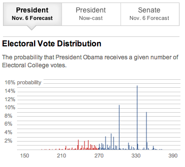
In the case of the Electoral Vote Distribution graph, there isn’t much significance in showing the extremes of the X- and Y-axis. If Nate’s team tightened up the range of the Y-axis to the highest point and the X-axis to, say, 100 points on either side of the data median, we wouldn’t need to get our reading glasses out.
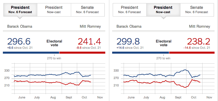
My only other critique is around the “Now-cast” effect above the charts. Presumably, there is a difference in how the model works if the election were to be held today rather than on election day. While I understand this in concept, the data wonk in me would like to know why that is. Some kind of contextual help would be beneficial to this feature for nerds like me.
Filtering Out Bias
As a UX researcher, I understand the difficulty in keeping your studies unbiased, but I always strive to minimize the margin of error in my work. The wide discrepancies between different polling organizations annoy me. If it’s clear your methods are showing a bias in any way, you should strive to fix that bias. If you are unable to approach your research without imposing your own views, you should express your research goals to another researcher who can be more objective. I’m fascinated by the fact that nearly every political pollster shows a clear house bias in one direction or the other and does nothing about it. Although Nate Silver is an unapologetic Obama supporter, his model tries to account for the house bias of each polling house regardless of which side of the aisle that bias is on. His methods are based on a combination of their historical performance and other historical trends Nate has noted. I thought that was great back in 2008 and I still do. What makes the site better now is that the visuals make sense.
Silver’s methods have received both praise and disapprovals. Of all of the poll roundups, I find his not only the easiest to use, but the most interesting in terms of relevance.
A Plea
I worked hard to avoid any political bias in this post. Although I have my own opinions and I hope you have yours, I don’t believe this is the place for me to air them. I DO have one important message to all of our readers: regardless of your political leanings, you should vote. If you don’t like your choices – write in a candidate or go to the booth and vote for nobody. In my mind, the only thing less patriotic than not voting is complaining about the outcome after you didn’t vote.

